In the fast-paced digital world, PNC Bank recognised the need to update its mobile banking app to meet modern user expectations. As a UX/UI Designer, I was part of the redesign process to offer an intuitive, visually appealing banking experience.
The initial analysis of PNC Bank's mobile app revealed a disjointed user experience and an outdated interface. These issues were causing frustration among users and hindering the app's performance in a competitive financial market. The project's primary challenge was to redesign the app to provide a seamless, modern user experience while maintaining the bank's integrity and trustworthiness.
The solution
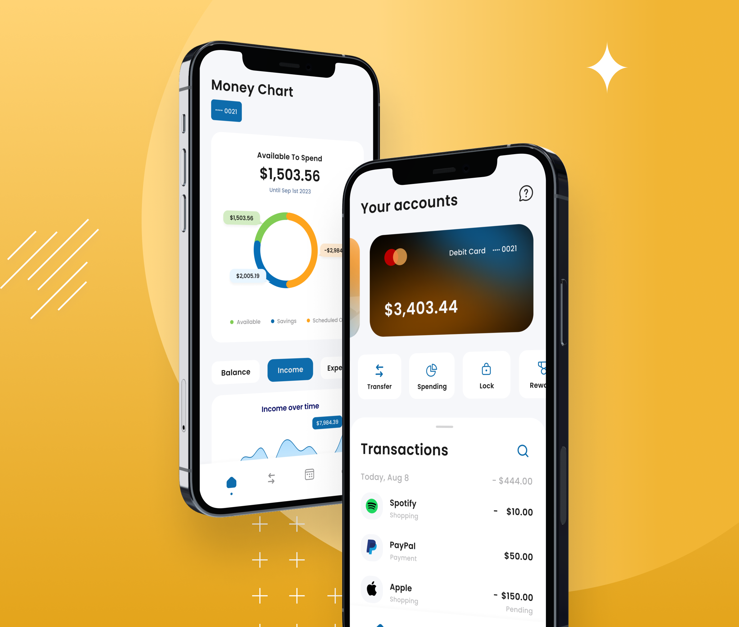
The redesign strategy focused on simplifying the userjourney, updating the visual design to a more contemporary look, andincorporating new functionalities that align with user expectations in today’sdigital age. The approach was to leverage the latest design trends andtechnologies to create an engaging and efficient banking experience for PNCBank's customers.
The Process
The Research
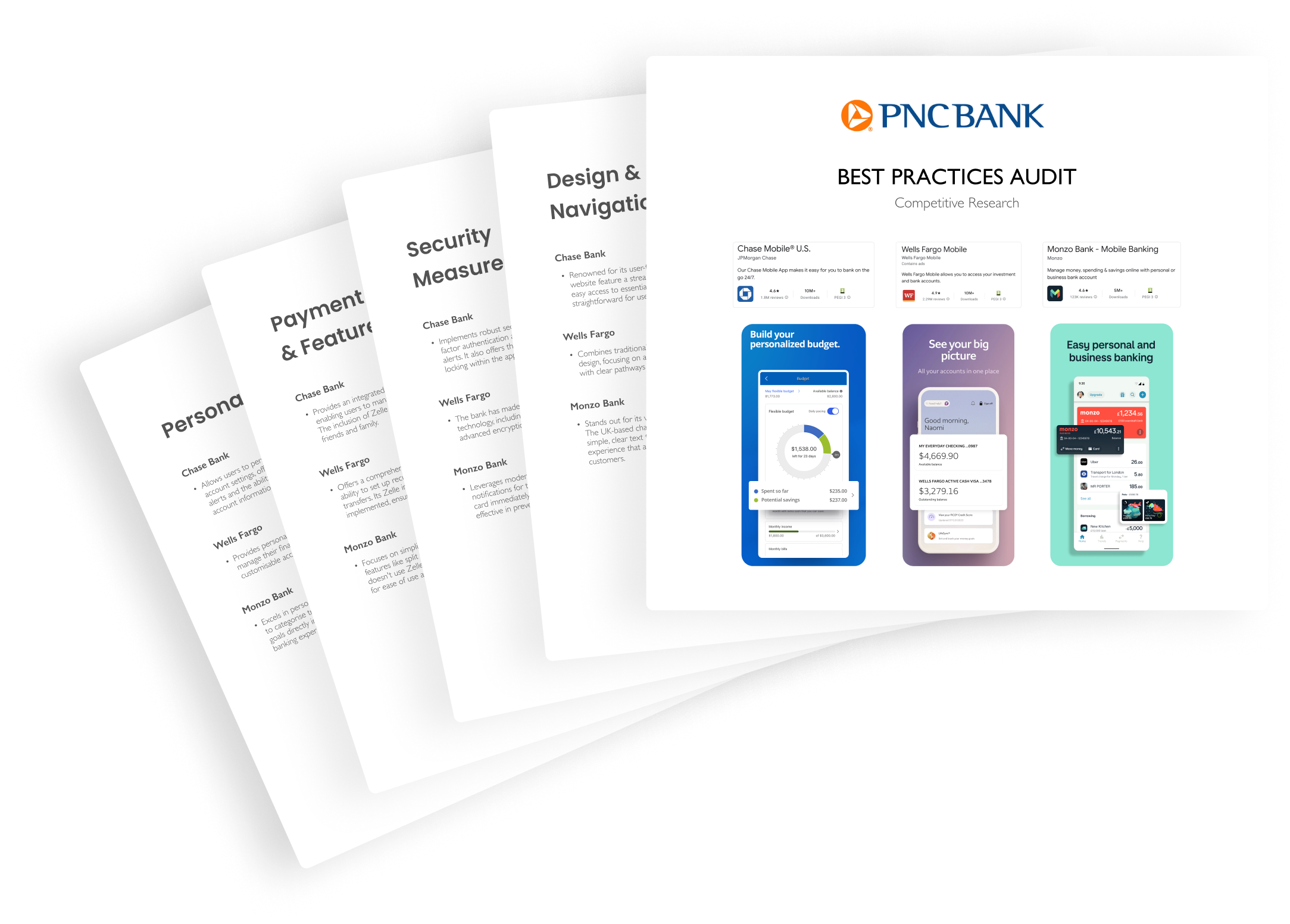
Competitive Analysis & Best Practices Audit
To gain a comprehensive understanding of the market, I started with analysing popular banking apps to identify key features and design elements contributing to their success, highlighting the importance of a clear navigation structure, quick access to essential functions and a user-friendly interface.
Qualitative Analysis
To gain deeper insights into the behaviours, preferences, and frustrations of mobile banking app users, further research was conducted through a series of surveys. The surveys targeted a diverse group of PNC Bank customers, focusing on their experiences with the current app and expectations for a redesigned version.
Key Insights
From a total of 35 participants, several common themes emerged in the feedback.
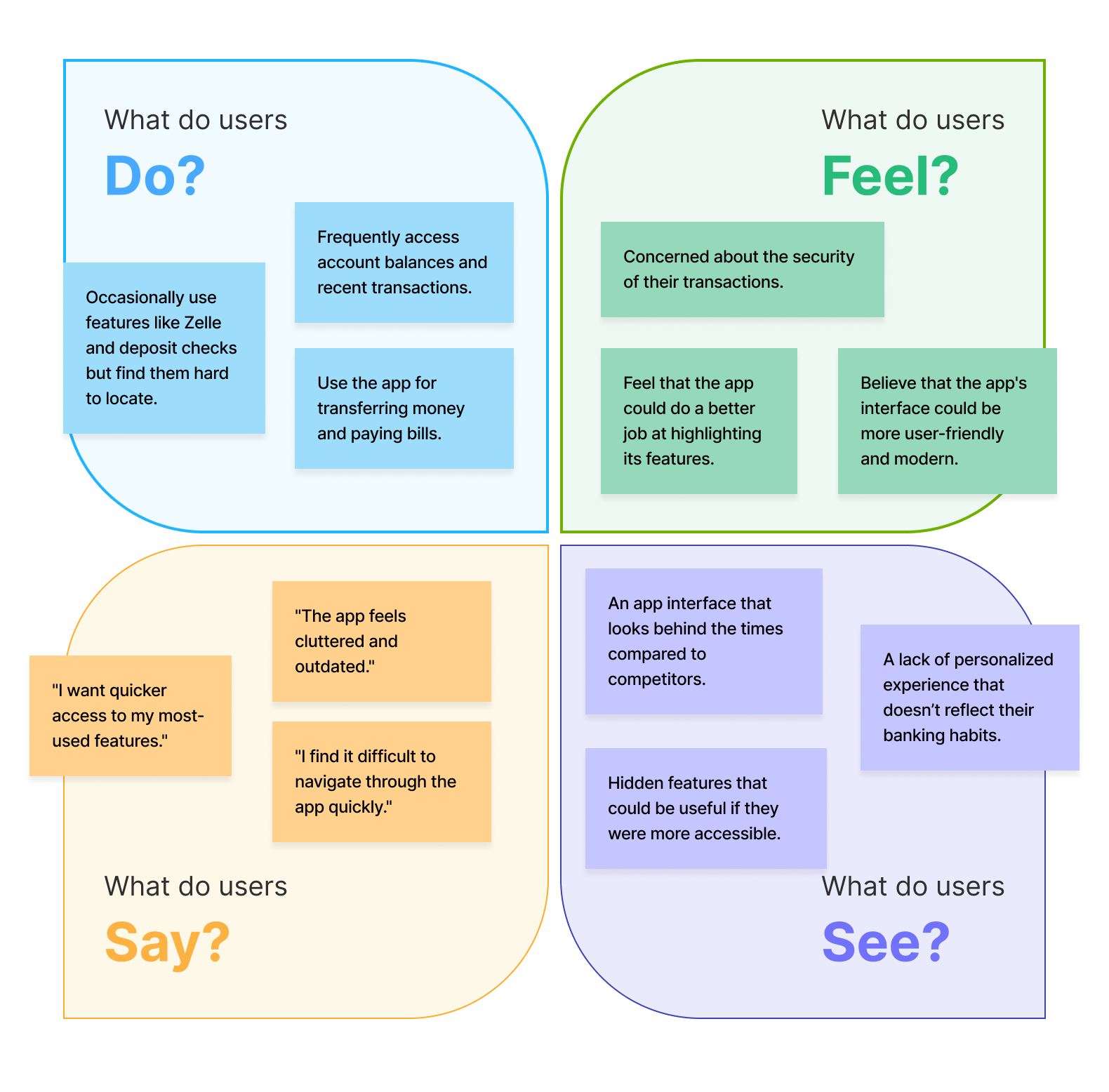
Navigation Challenges: Users mentioned that finding specific features in the app takes a long time.
Visual Design: It was mentioned that the app looks outdated compared to other banking apps on the market.
Feature Discoverability: Some users did not know about certain features available through the app until recently due to the lack of proper visibility.
Personalisation: The majority of users wanted the app to provide a tailored interface or quick options based on their most frequent activities.
Empathy Map
To gain a holistic understanding of our users, I created an empathy map to systematically organise the users' shared experiences into four categories: Think, Feel, Say, and Do.
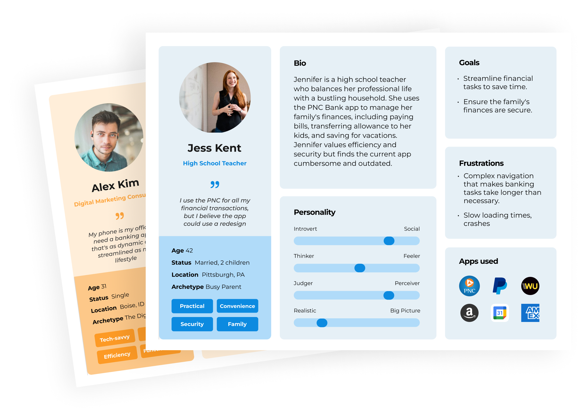
User Personas
I then crafted 2 user personas that represented PNC Bank's target audience, detailing aspects such as age, occupation, personality traits, goals, frustrations.
UX
User Experience Design
User Experience Design combines scientific accuracy with creativity to craft a product's functional framework. It methodically defines user interaction by planning information architecture, user flows, low and high-fidelity wireframes.
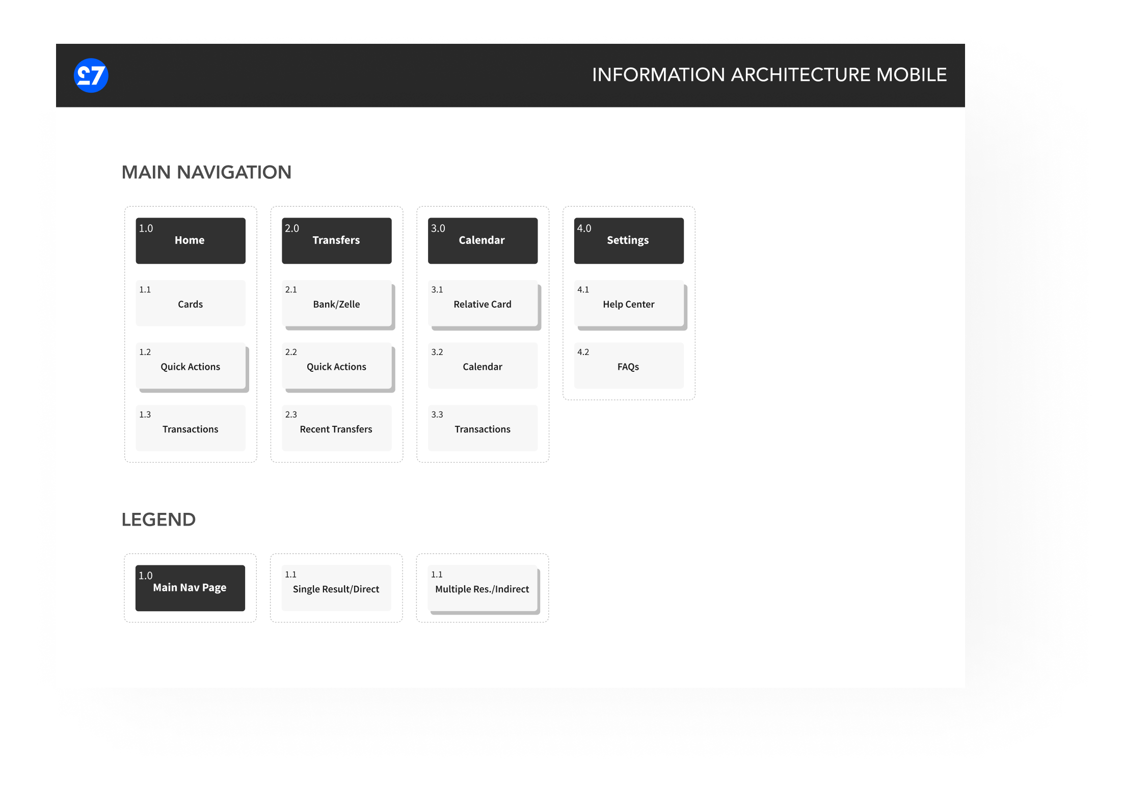
Information Architecture
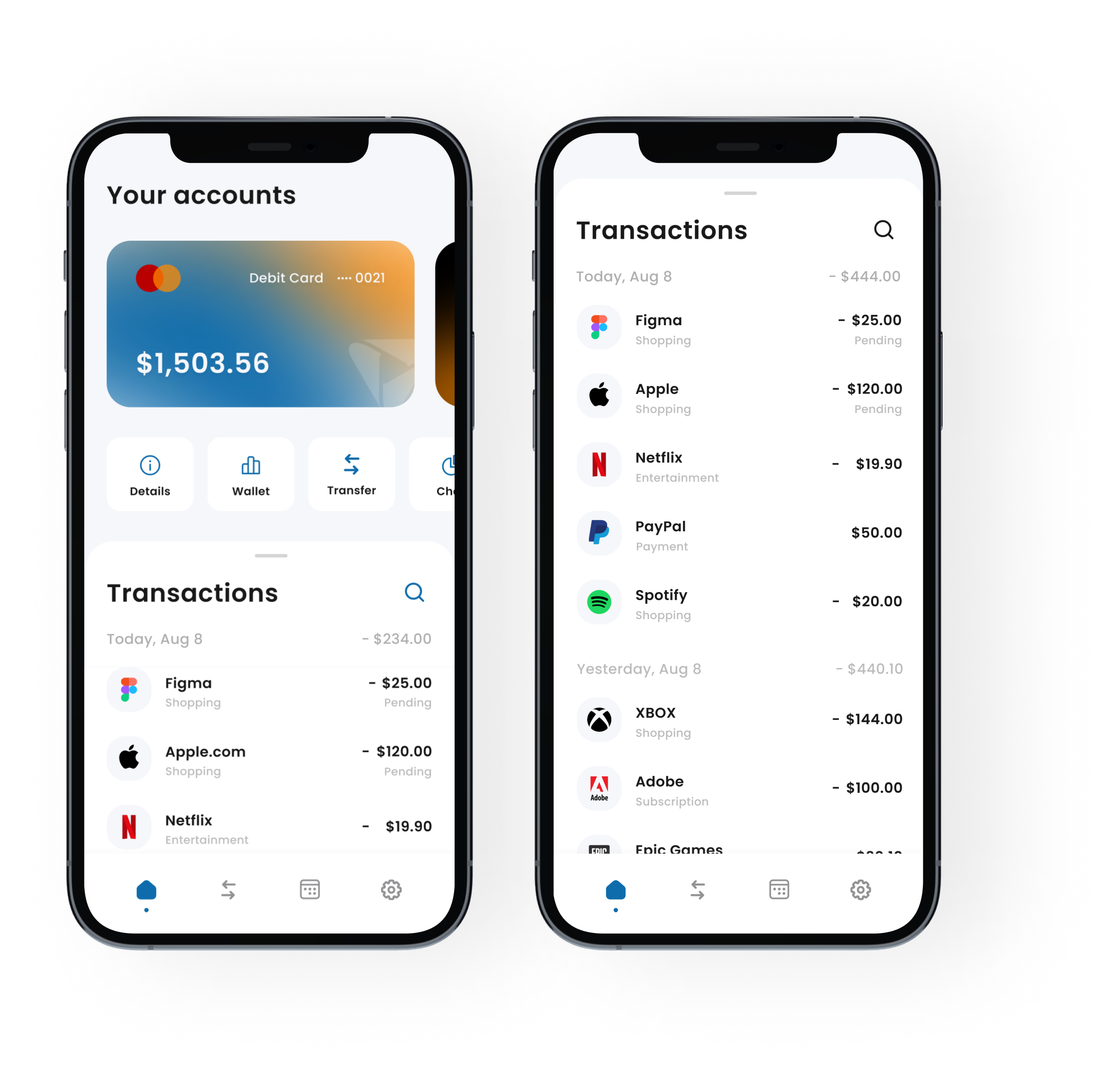
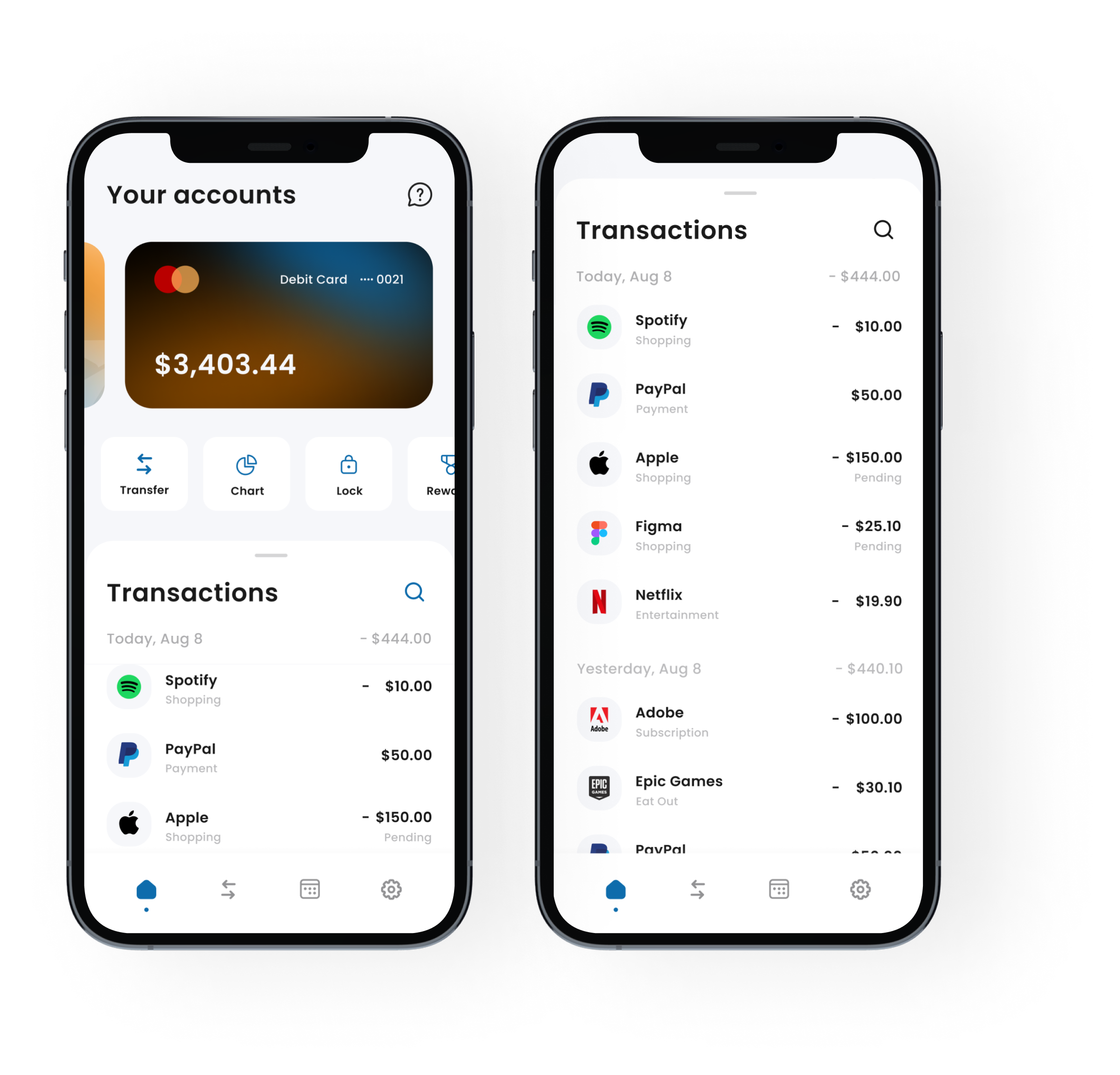
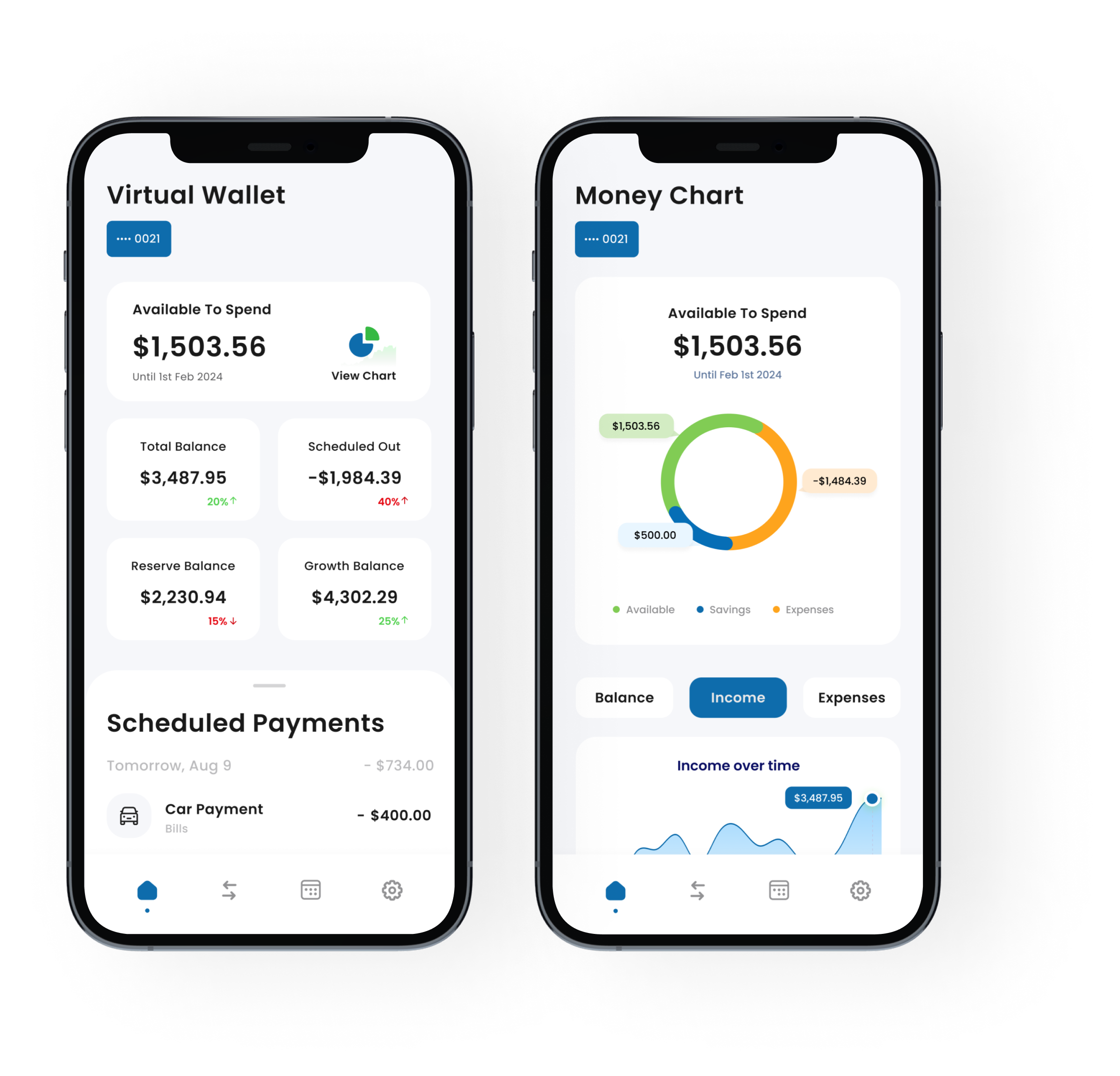
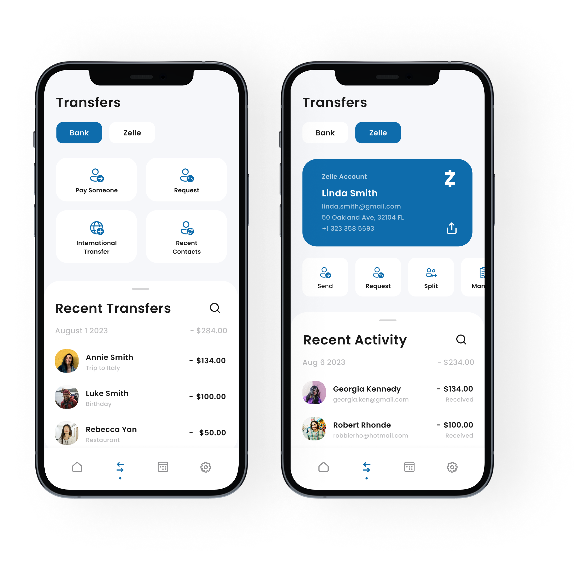
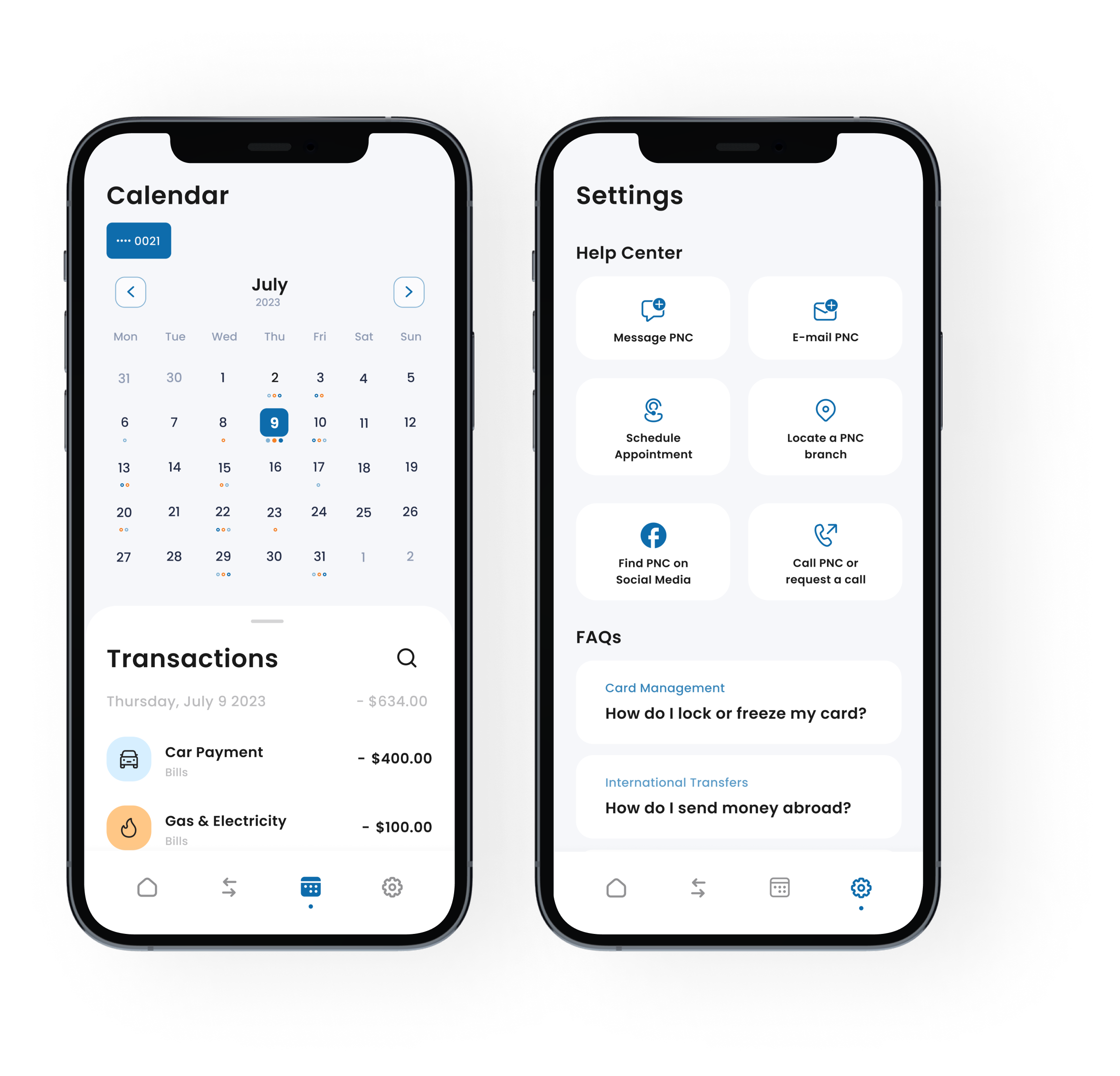
Building on user feedback that highlighted navigation issues, the information architecture was restructured to prioritise ease of access to frequently used features. The redesigned site map focuses on a more logical grouping of services, reducing cognitive load and enabling quicker navigation to core functionalities like Accounts, Transfers, and Bill Payments.
Sketches
The initial design phase started with sketching, rapidly moving ideas to explore various layout options. These sketches evolved into medium and high-fidelity wireframes, focusing on the placement of elements and the overall user journey without the distraction of visual design details.
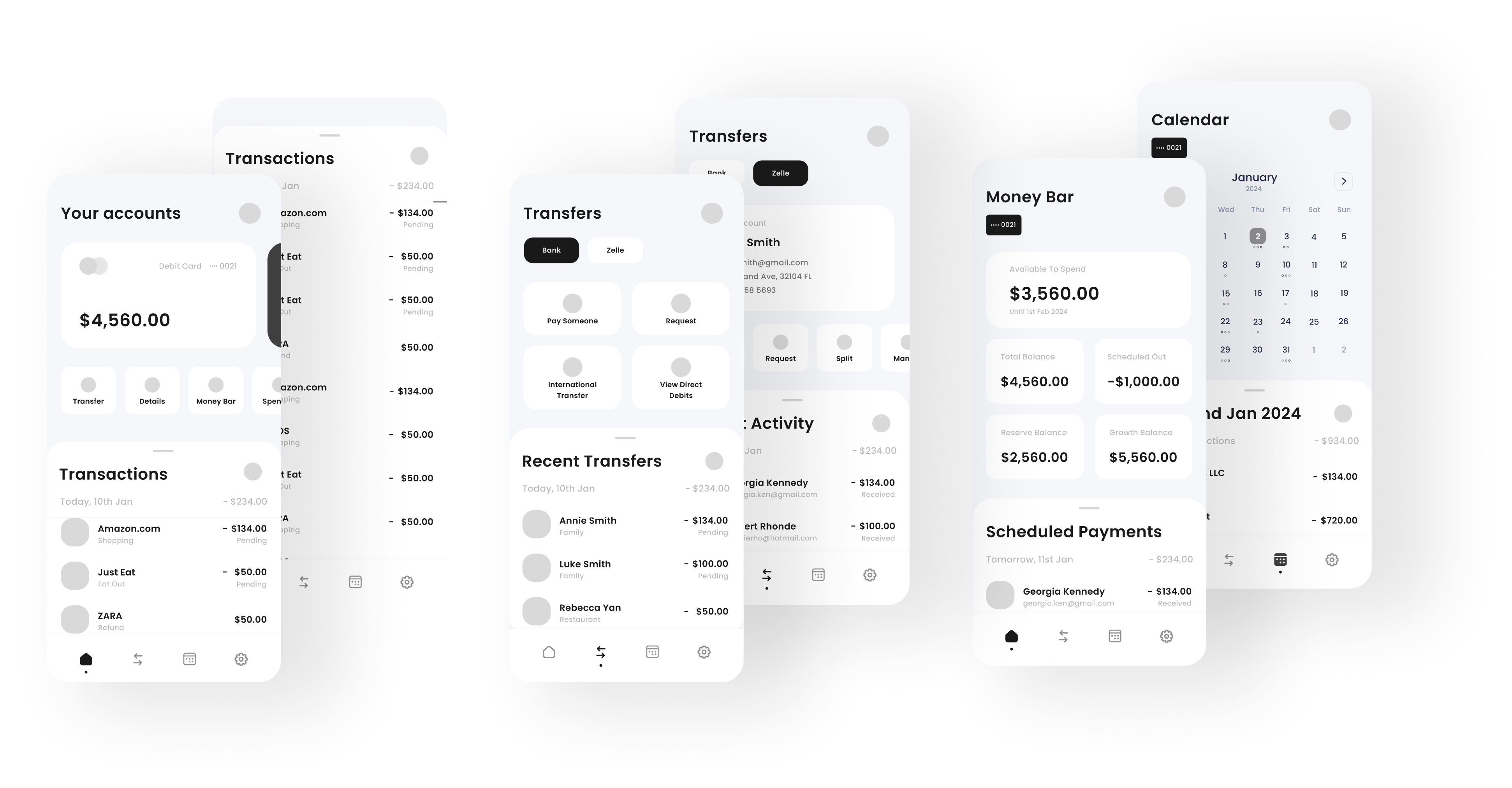
High-fidelity Wireframes
With the structure and flow solidified, the project advanced to higher fidelity wireframes which served as the blueprint for the final design.
UI
User Interface Design
User Interface (UI) Design is the aesthetic discipline that guides the product's visual interaction with its users. This foundational step is crucial in developing a unified visual language, laying the groundwork for all design elements that follow.
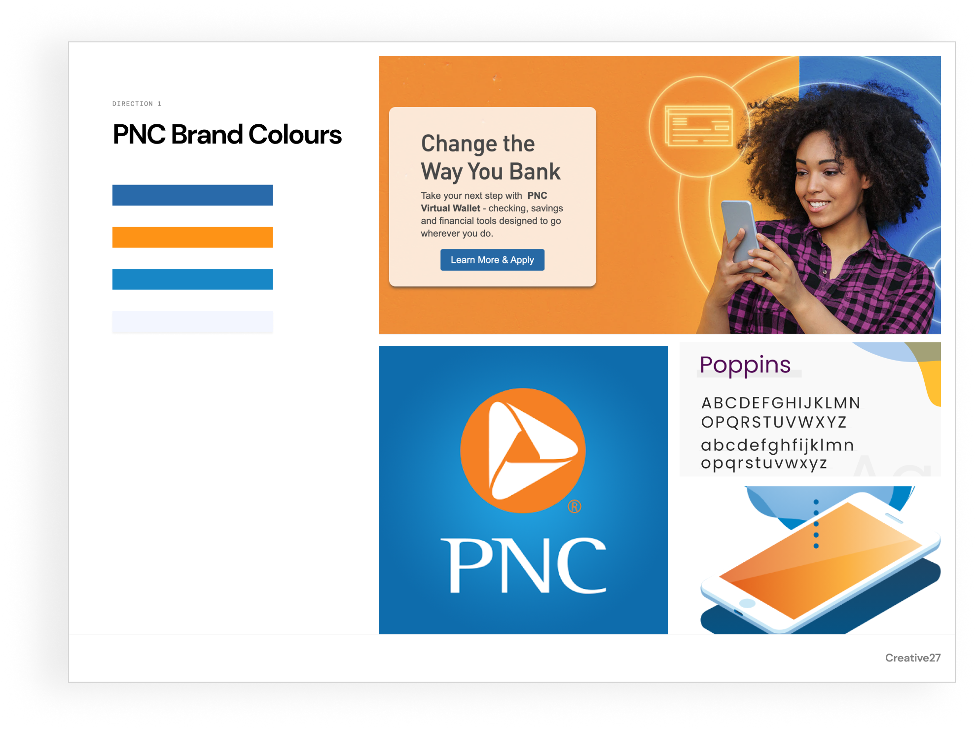
Mood-Board
The process began with the development of mood-boards to explore different visual directions.
The chosen direction used a palette that combined PNC Bank's brand colours with new, vibrant accents for a more engaging user interface. Typography choices focused on clarity and accessibility, selecting a font that is easy to read on various devices and screen sizes.