Surgical Focus is a startup born amidst the COVID-19 pandemic to address the difficulty patients faced in accessing in-hospital care. The surge in patient bookings overwhelmed healthcare facilities, creating a demand for alternative patient engagement solutions. Their response is a tablet app that bridges the gap between patients and medical staff, allowing for effective pre-op and post-op support from the comfort of the patient’s home.
The healthcare sector's saturation with patient bookings, especially during the pandemic, prompted Surgical Focus to seek a digital solution. The challenge was to design a user-centric interface that enables seamless engagement in pre and post-operative care, suitable even for patients with limited technical proficiency.
The Solution
Our design philosophy cantered on two pillars:
Intuitive User Experience: We crafted an interface that guides users through their pre-surgery and post-operative care, focusing on simplicity and ease of use.
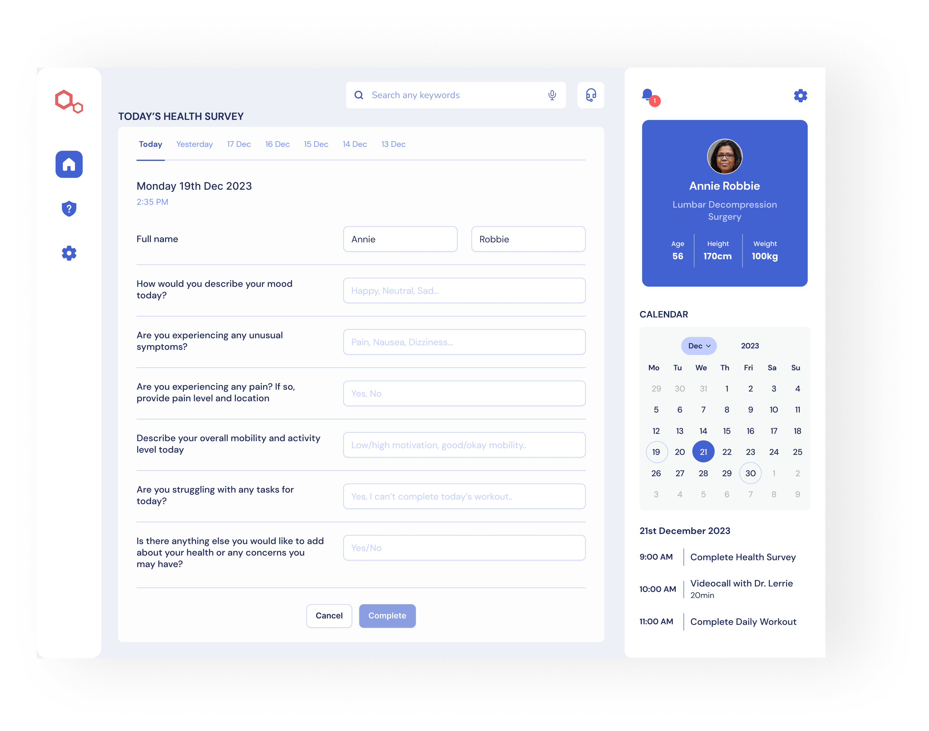
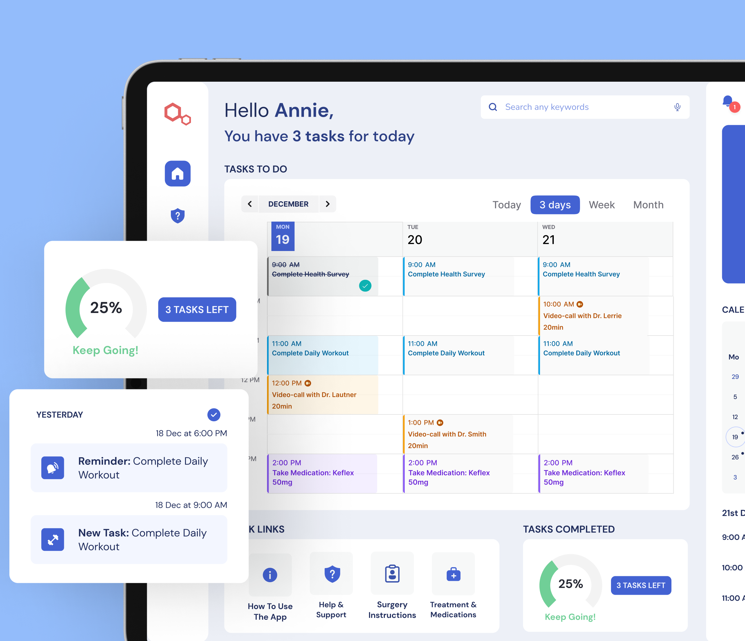
Tailored Pre- and Post-Surgery Routines: The app offers personalised routines, including diet, exercise, and medication schedules, based on individual medical recommendations.
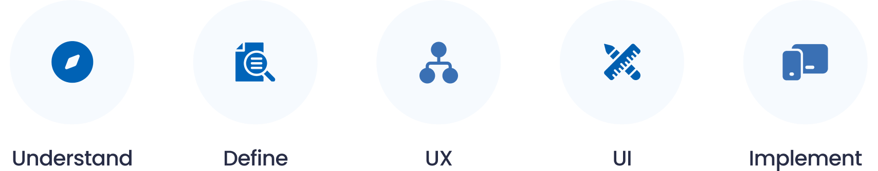
The Process
The Research
Qualitative Analysis
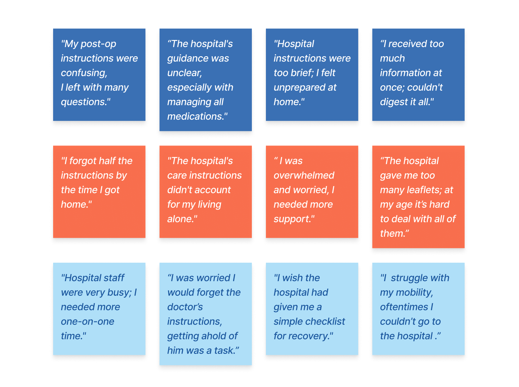
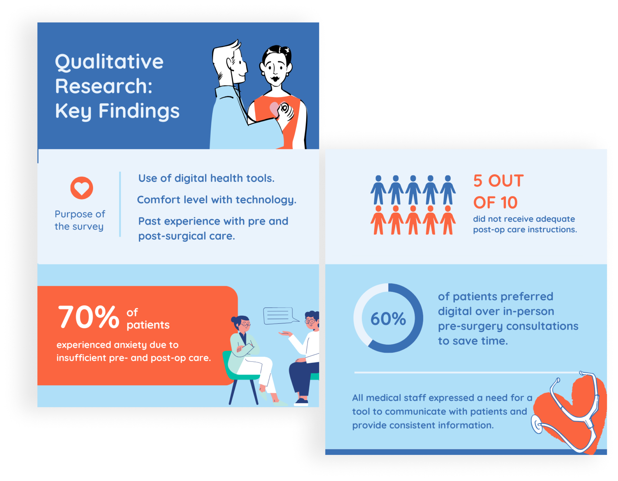
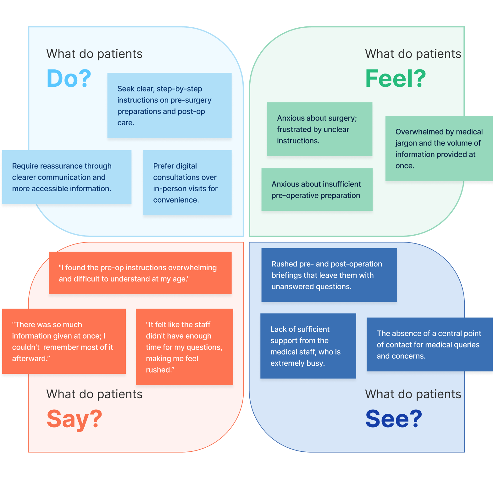
To dive deeper into user behaviours and attitudes, we’ve started with qualitative research. The process included surveying and interviewing patients who underwent surgery and medical staff, we then synthesised the collected data to create empathy maps and user personas, essential in understanding their needs and pain points.
Surveys
We surveyed 25 patients who underwent surgery within the last two years.
Interviews
We also conducted interviews with 8 past surgical patients, predominantly within the age group of 50s to 70s, and 6 medical professionals, including doctors and nurses. The interviews provided valuable insights into the unique challenges and preferences of older patients navigating pre- and post-surgery care.
Empathy Map
With the qualitative data collected from user interviews, I created an empathy map. This enabled me to detect recurring themes among patients and systematically organise them in 4 categories.
User Personas
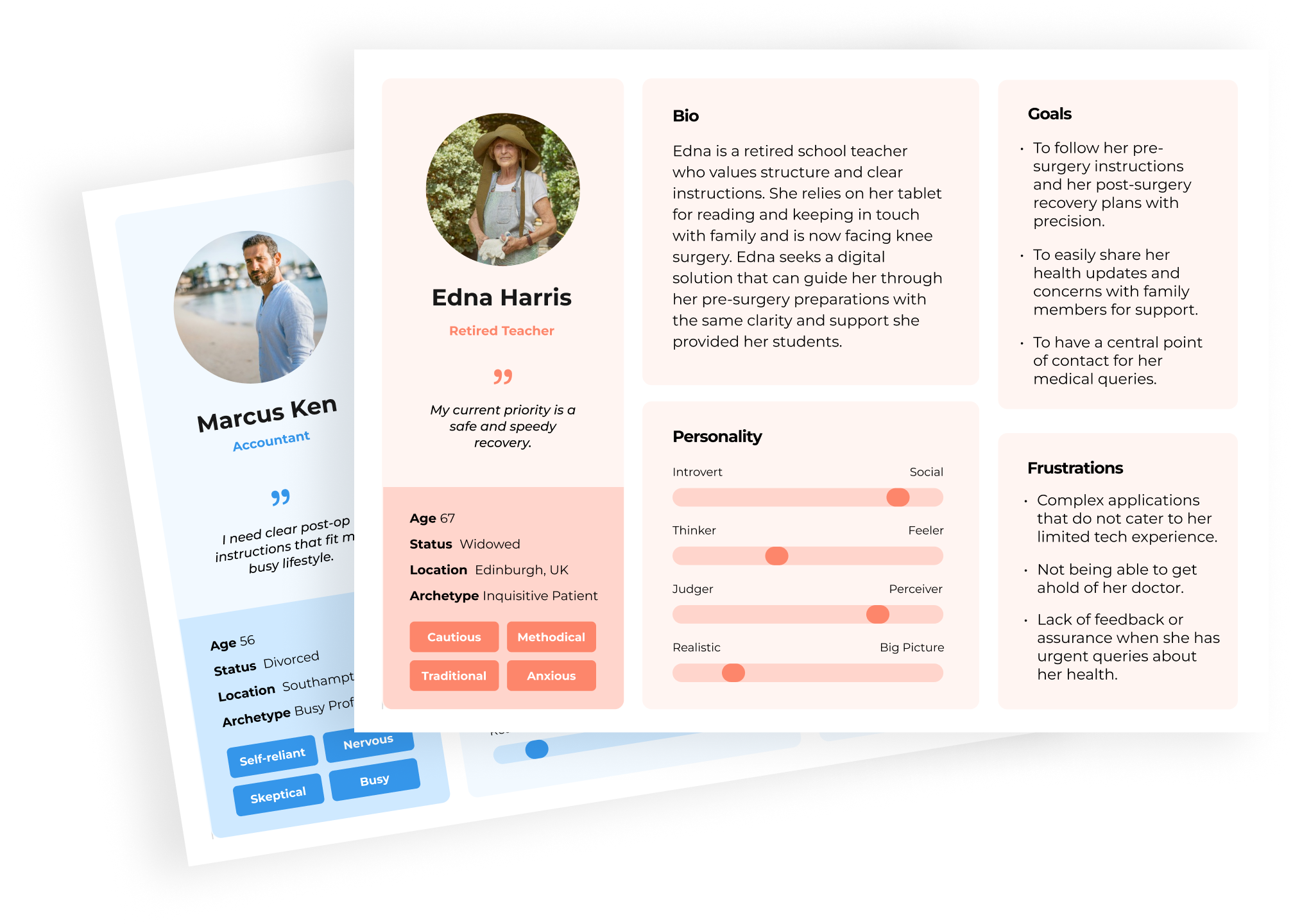
With the qualitative data collected from the user interviews, I crafted 3 user personas, detailing aspects such as age range, occupation, perosnality, goals and frustrations.
UX
User Experience Design
User Experience Design combines scientific accuracy with creativity to craft a product's functional framework. It methodically defines user interaction by planning information architecture, low and high-fidelity wireframes. It also involves usability testing to validate design hypotheses, ensuring a seamless and intuitive user experience.
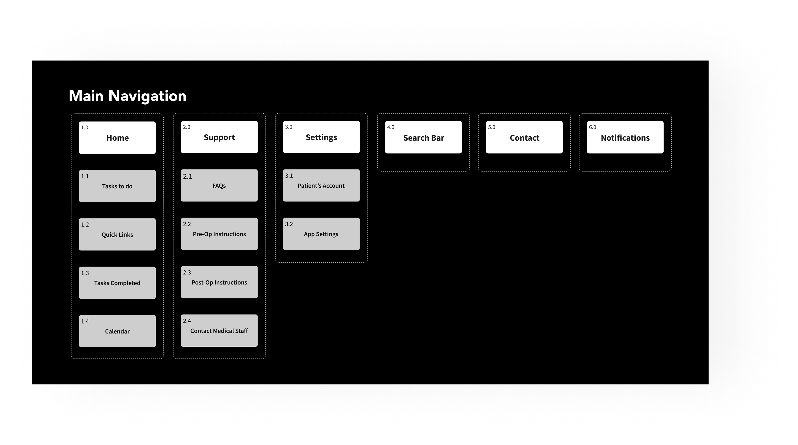
Information Architecture
I started with developing an information architecture to ensure the navigation was straightforward and the users could easily find what they were looking for right as soon as they opened the homepage.
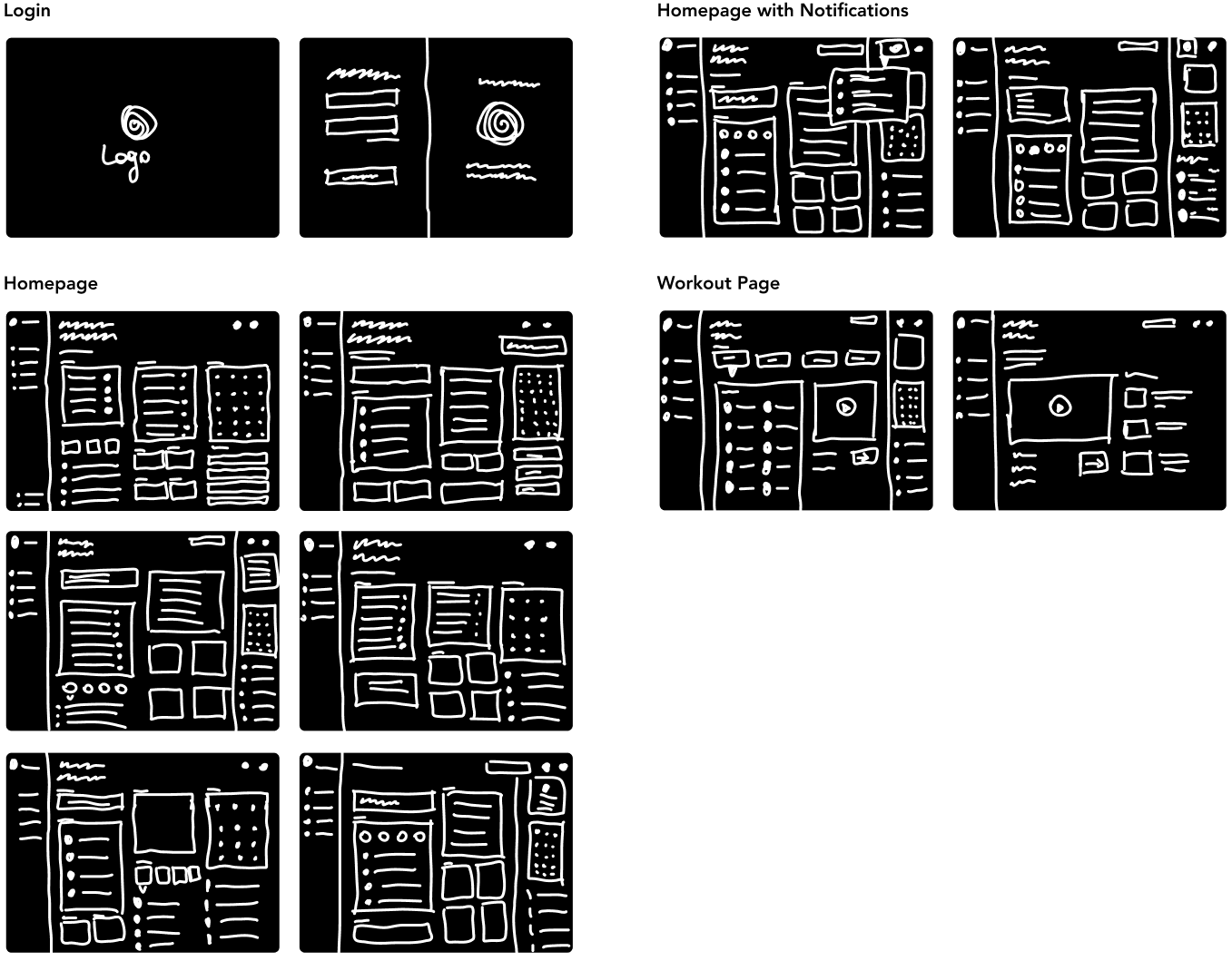
Sketches
Sketches focused on developing a logical layout that foregrounds essential tasks. We progressed to wireframes, which detailed the user interface elements and the flow between screens.
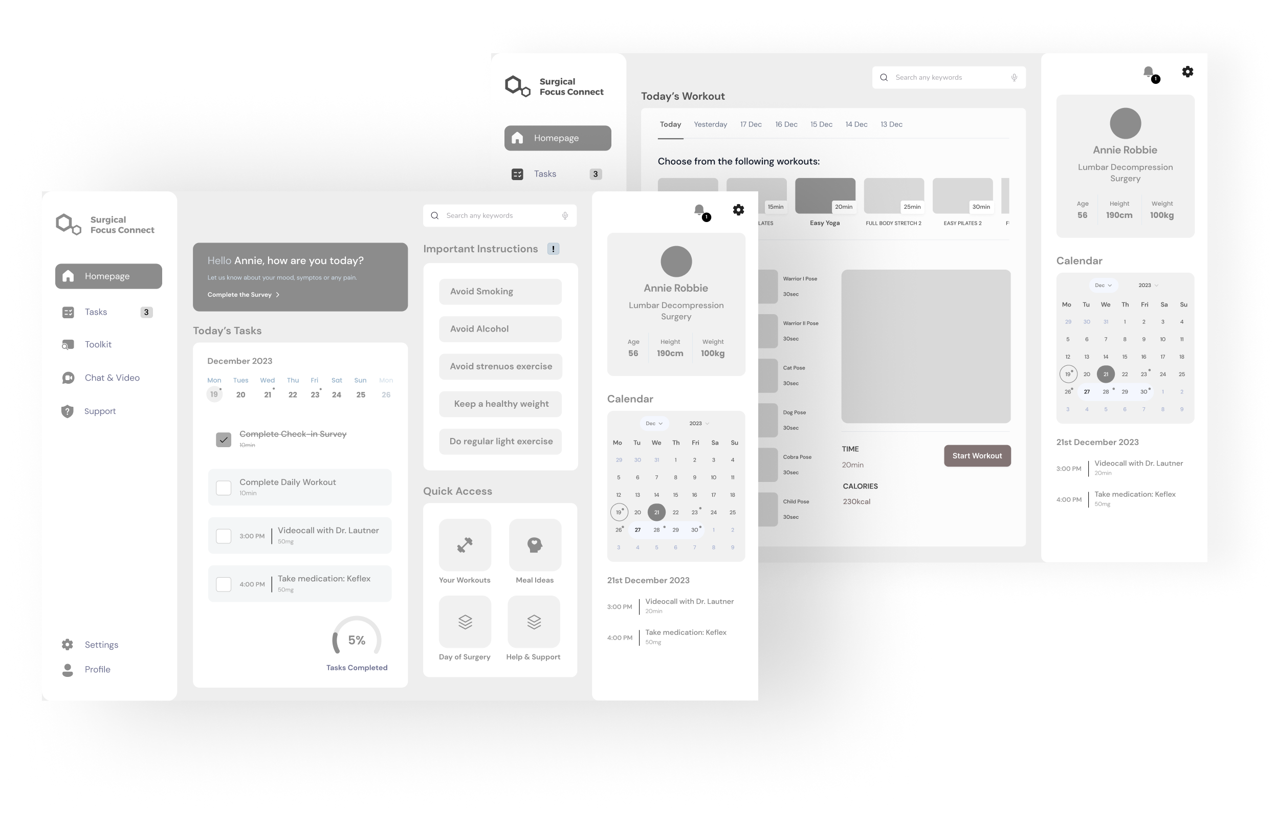
High-fidelity Wireframes
Wireframes translated concepts from sketches into tangible visual representations, laying the foundation for the app's design.
UI
User Interface Design
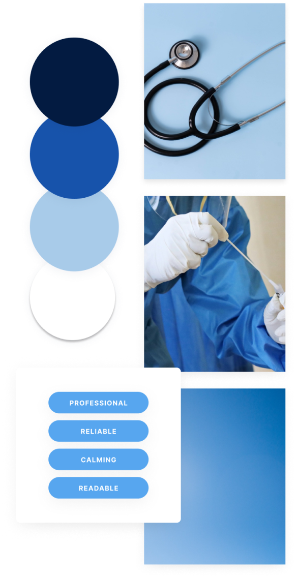
User Interface (UI) Design is the aesthetic discipline that guides the product's visual interaction with its users. It begins with the development of mood boards, which act as visual guides to establish the product's overall aesthetics. Here, my goal was to reflect the app’s purpose visually. An interface that would evoke trust, comfort and safety.
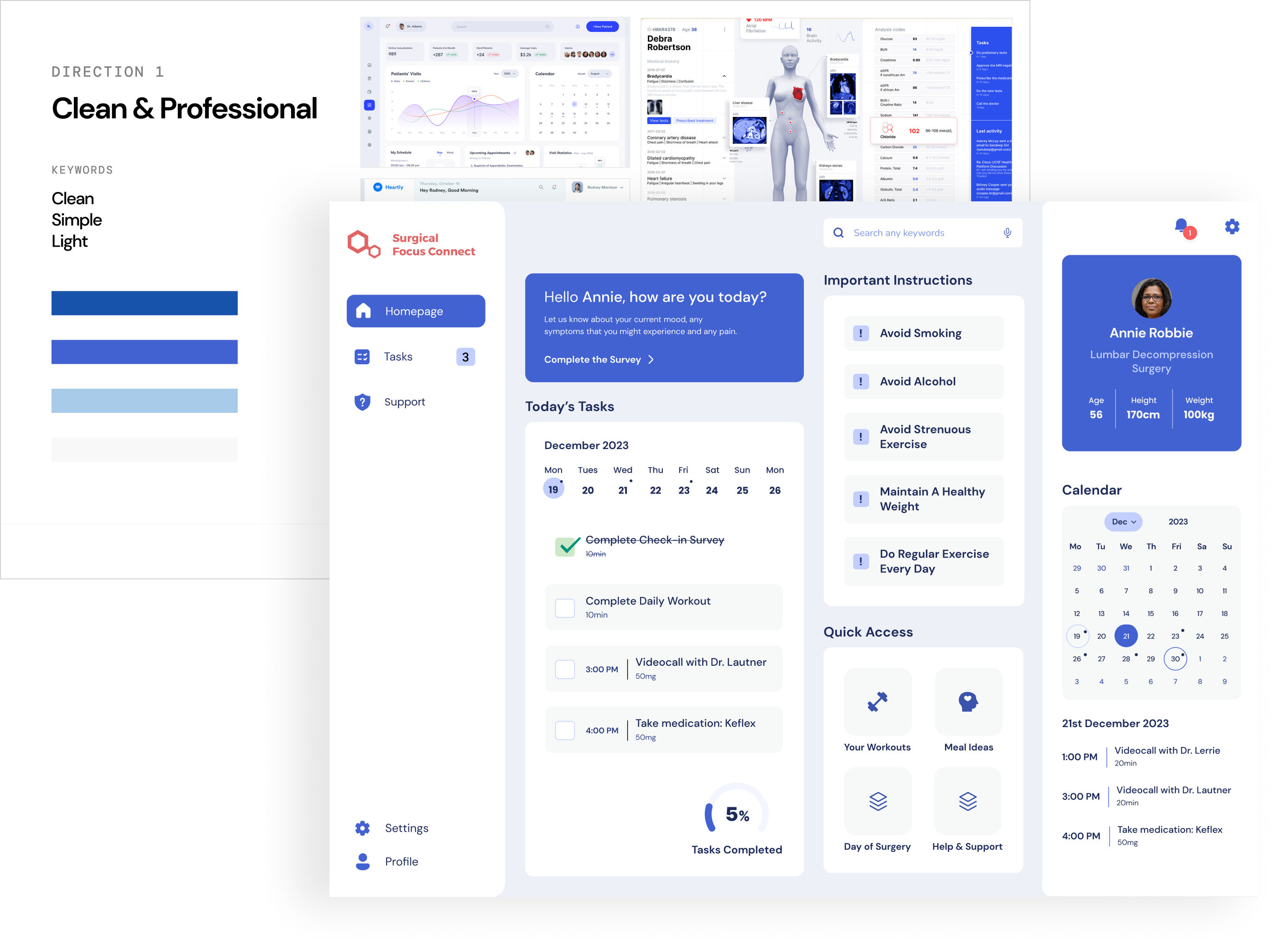
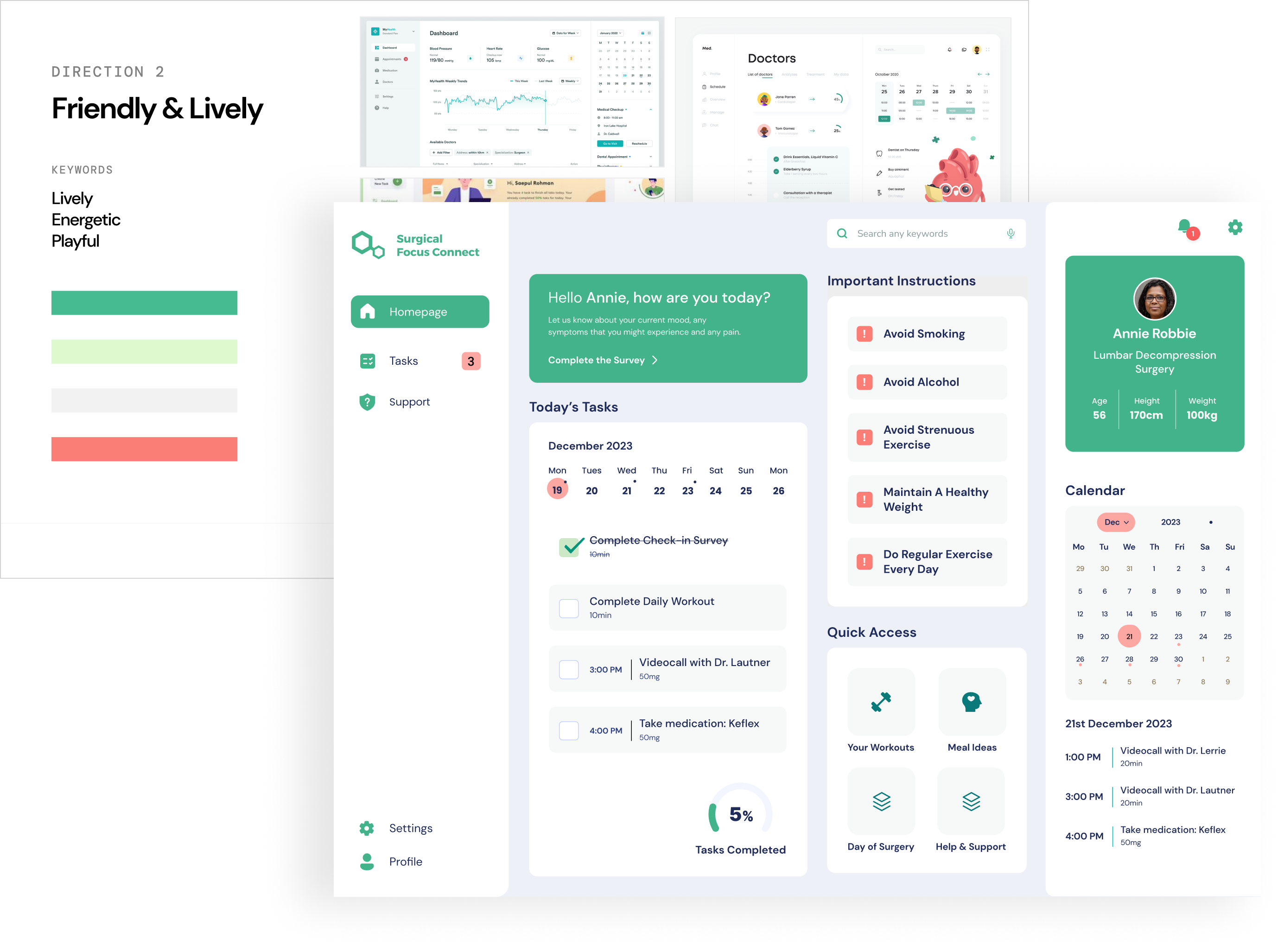
Mood-Boards
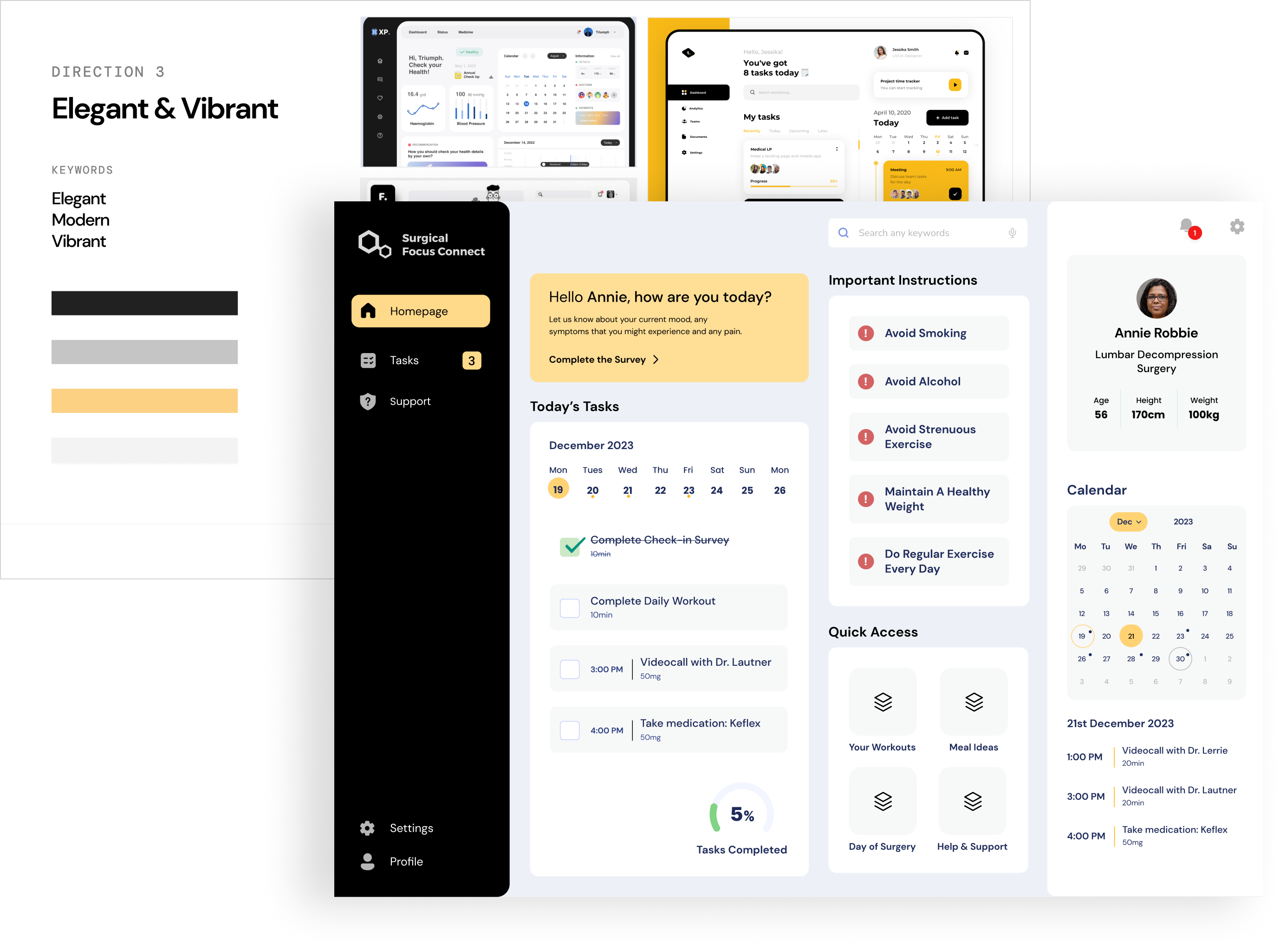
I explored three different mood boards and colour palettes, after analysing medical dashboards, medical websites, apps on the web. I then applied each colour scheme to the homepage design to get a better sense of the look and feel of the product.
Final Choice
After careful consideration, we decided to opt for the first colour palette. Blue is often associated with trust and reliability; in a healthcare context, using blue can convey a sense of professionalism and dependability, helping users feel more secure and reassured.
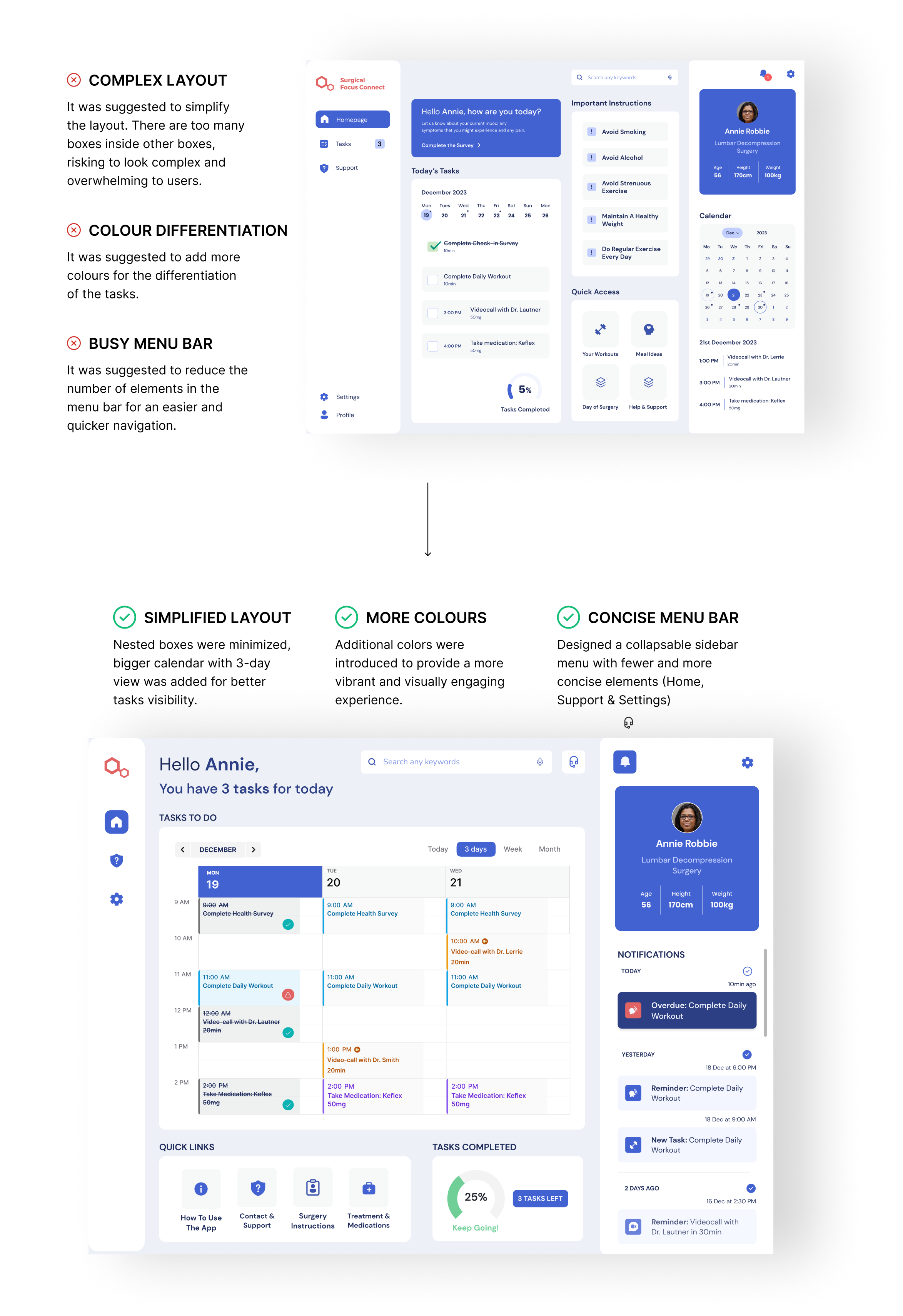
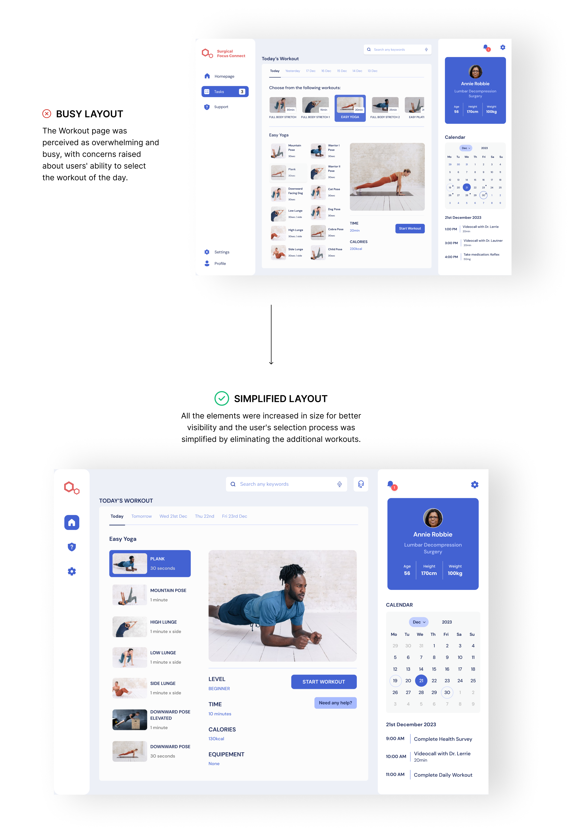
Usability Testing
We then received useful feedback from usability testing, this led to further refinements and adjustment.
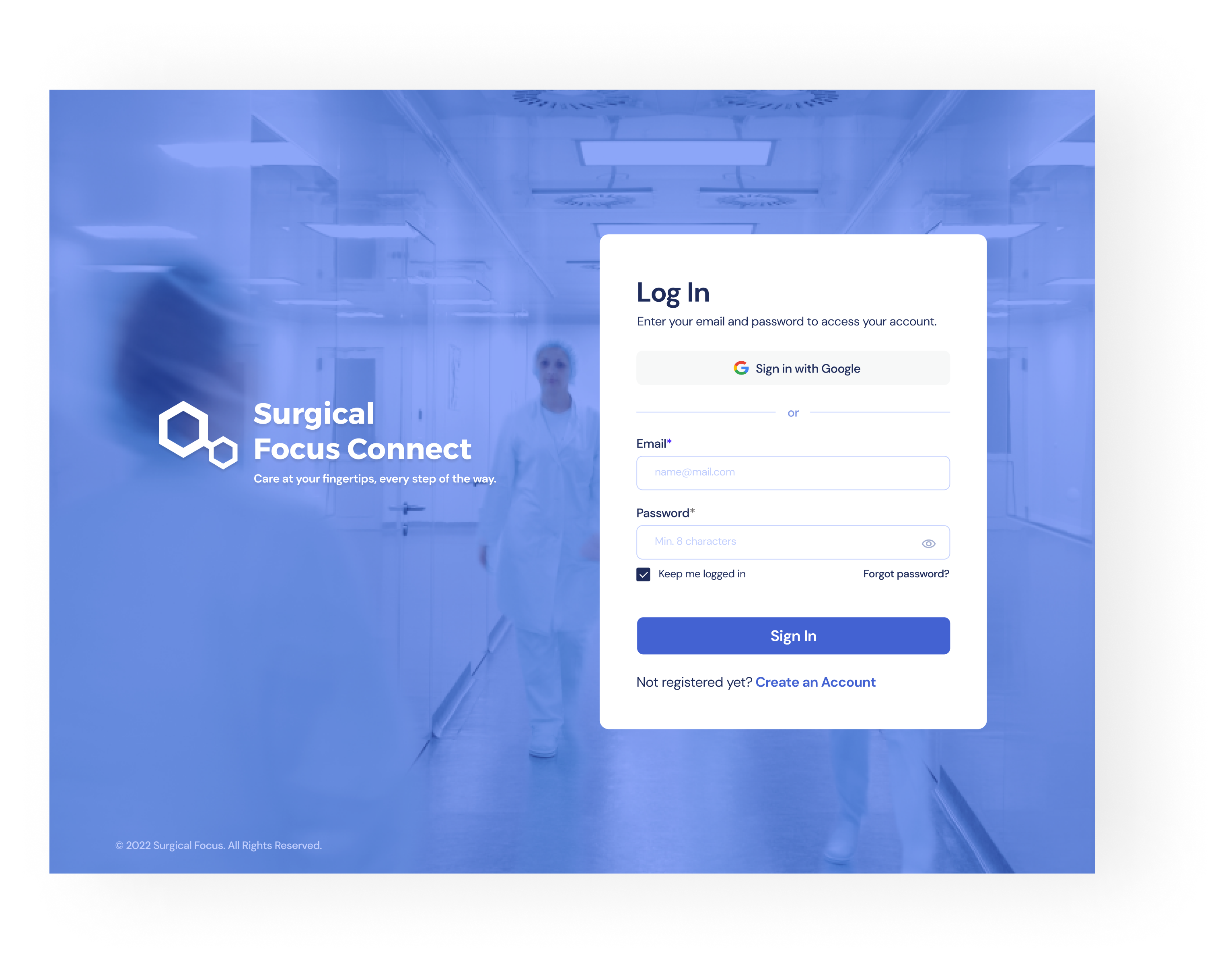
UI
Final Design
Finally, all of the efforts culminated in the final design. The app combines a user centred design with simplicity and functionality.

.png)
.png)
.png)