The "Travelling Dentist" project involved creating a digital platform for Dr. Michael Tiplea, a dental specialist offering mobile oral surgery services across Texas, USA, who was looking to expand his reach and improve service accessibility. The project's objective was to design an intuitive, user-friendly website that effectively communicates Dr. Tiplea's services and facilitates appointment scheduling for dental offices.
Role
Research, UX Design, UI Design
Tools
Figma, Adobe CC, Miro, Tally, HeyCollab
The Problem
The primary challenge was designing a product that would resonate with a dual target audience: dental offices seeking partnership opportunities and patients interested in knowing more about Dr. Tiplea. The focus was given primarily to dental offices, which demanded a very specific and reliable digital presence to establish trust before any engagement.
The Solution
The solution was to design a website that would be reliable, professional, and accessible. We focused on creating a digital platform where users could easily access comprehensive service information, get in contact with Dr. Tiplea, book appointments, and explore dental health resources.
The Process
The Research
Competitive Analysis
A thorough analysis of competitors was conducted, examining companies who provide similar service to benchmark best practices and identify market gaps. The strategy focused on highlighting Dr. Tiplea's unique selling propositions - mobility, convenience, and specialised services.
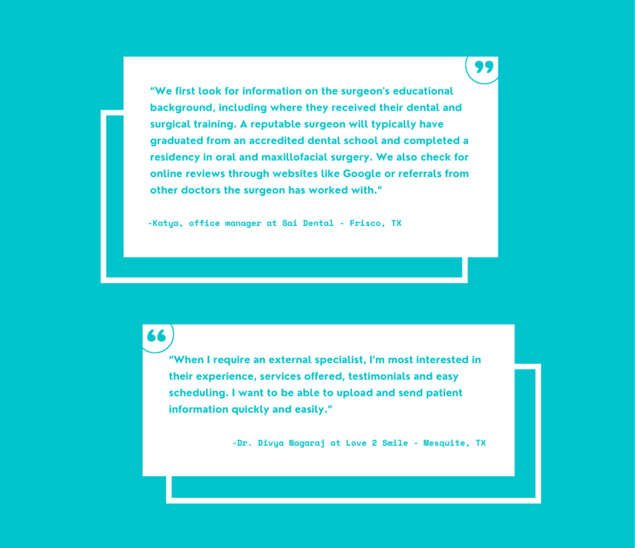
Qualitative Analysis
To dive deeper into the needs, preferences, and frustrations of our primary users, we conducted detailed surveys and interviewed dental offices managers and dentists to gather actionable insights. We focused on dental office managers and dentists who have previously engaged or considered engaging with traveling dental specialists.
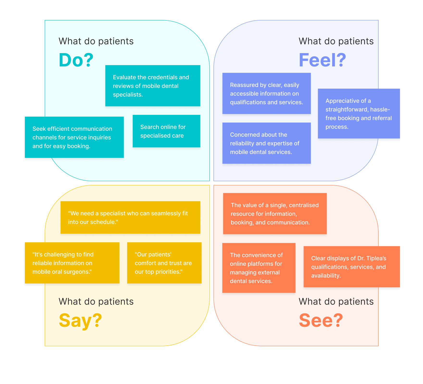
Empathy Map
We developed empathy maps to understand the emotional and psychological landscape of our users. with a specific focus on what our users feel, think, see, and do; ensuring our solutions were always aligned with user needs.
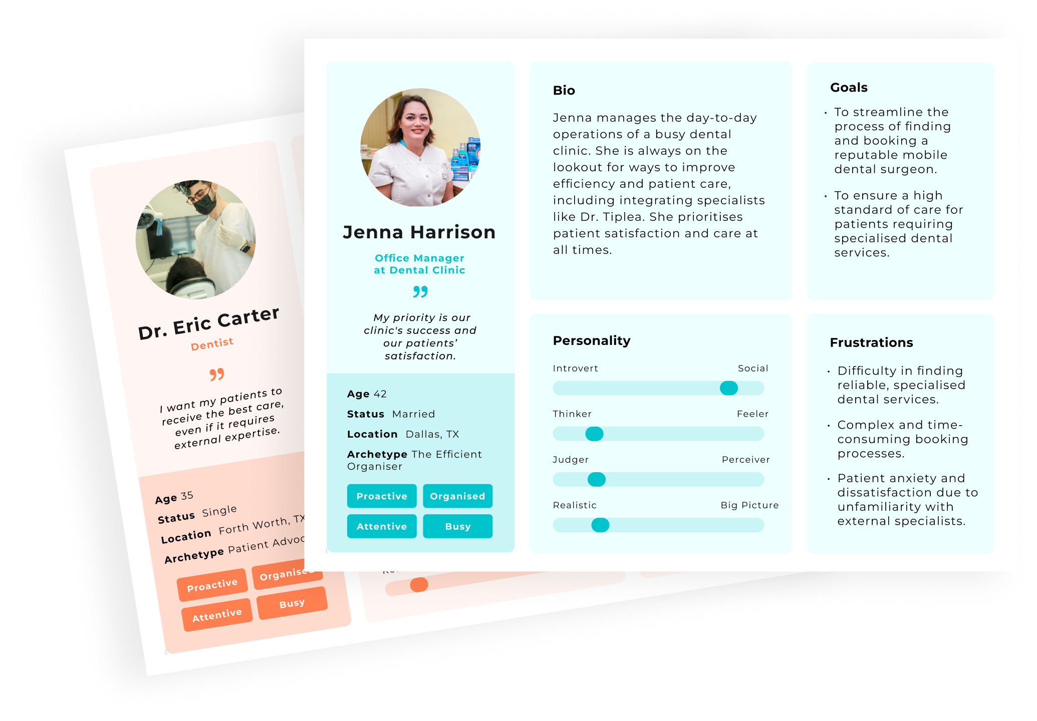
User Personas
The user personas represented our primary user groups and included demographic information, personality, goals, and pain points. This enabled us to have a clear vision of who we were designing for and how to best meet their needs.
UX
User Experience Design
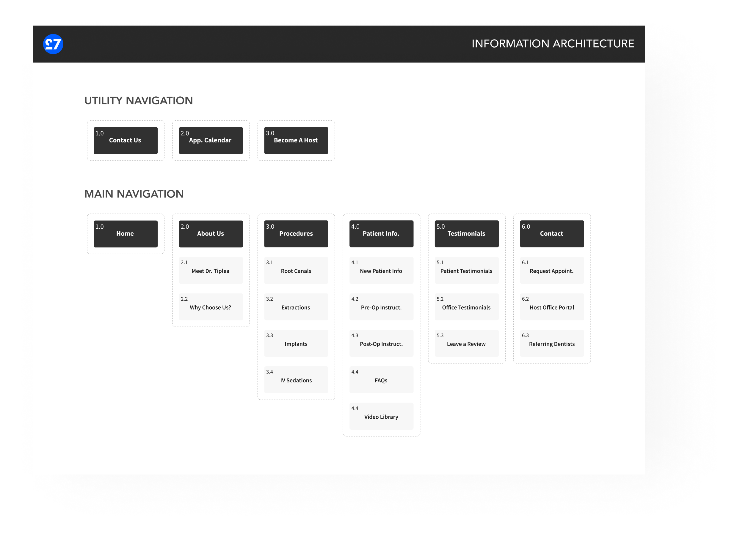
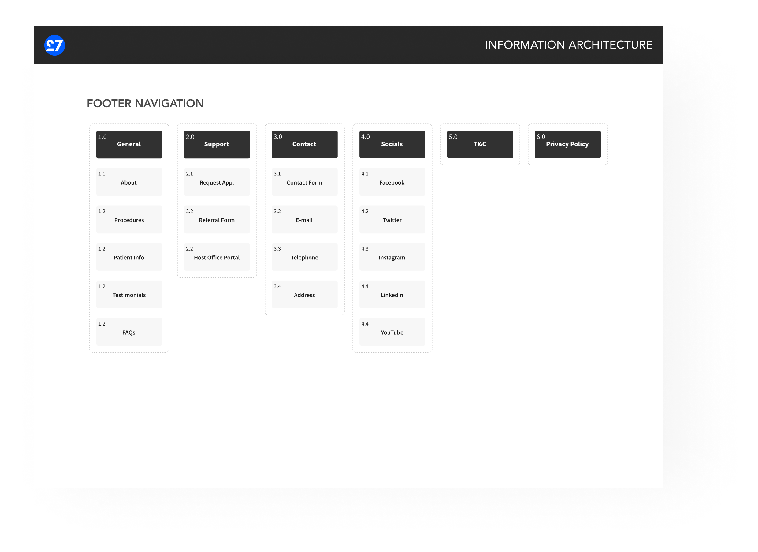
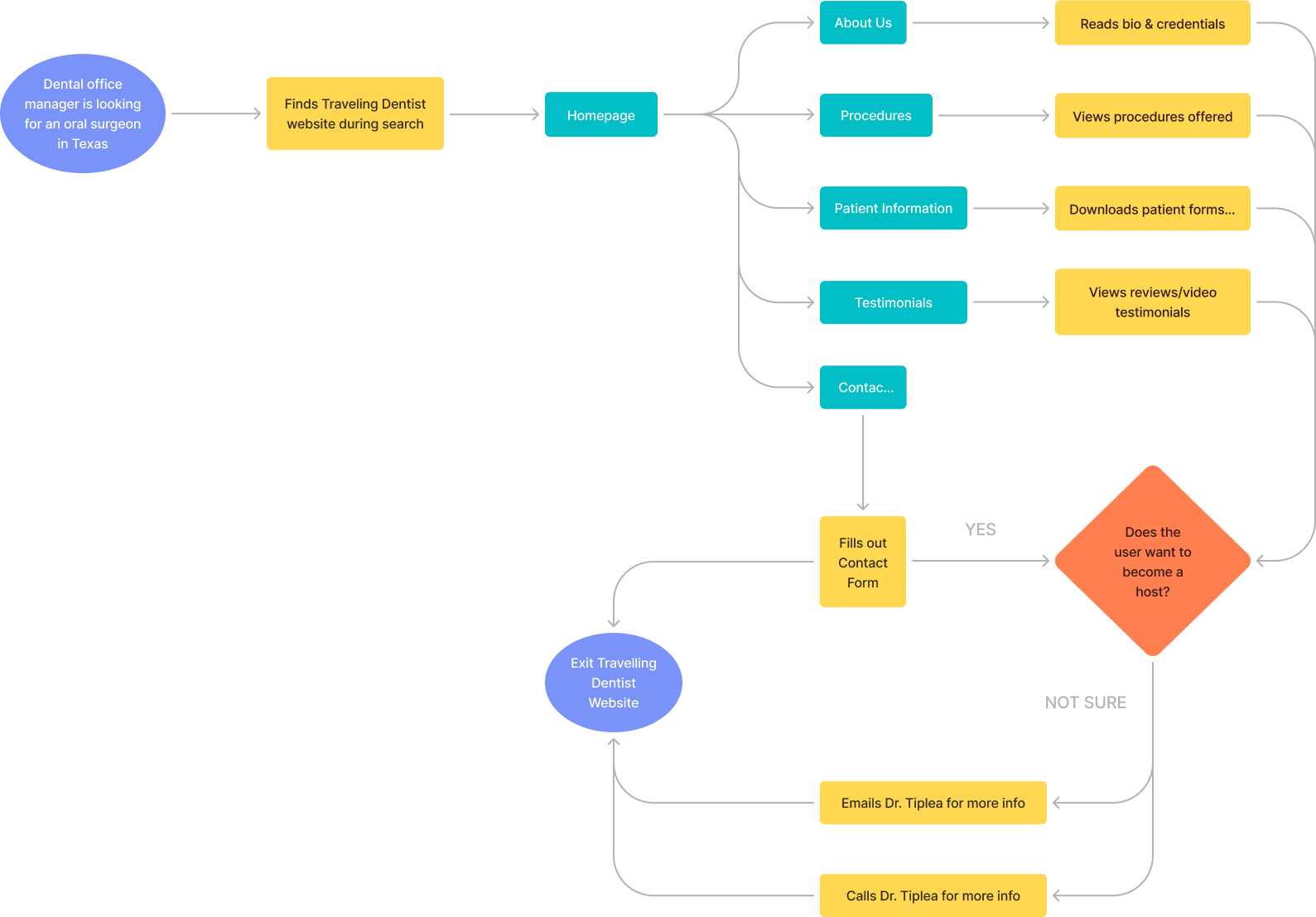
At this stage, we focused on the website's structural foundation, ensuring intuitive navigation, ease of access and proper organisation of information.
The process involved creating an information architecture to visualise the content organisation, and user flows to map out the pathways users might take through the website, ensuring a seamless journey from the homepage to booking an appointment or accessing dental health resources.
Information Architecture & User Journey
User Journey
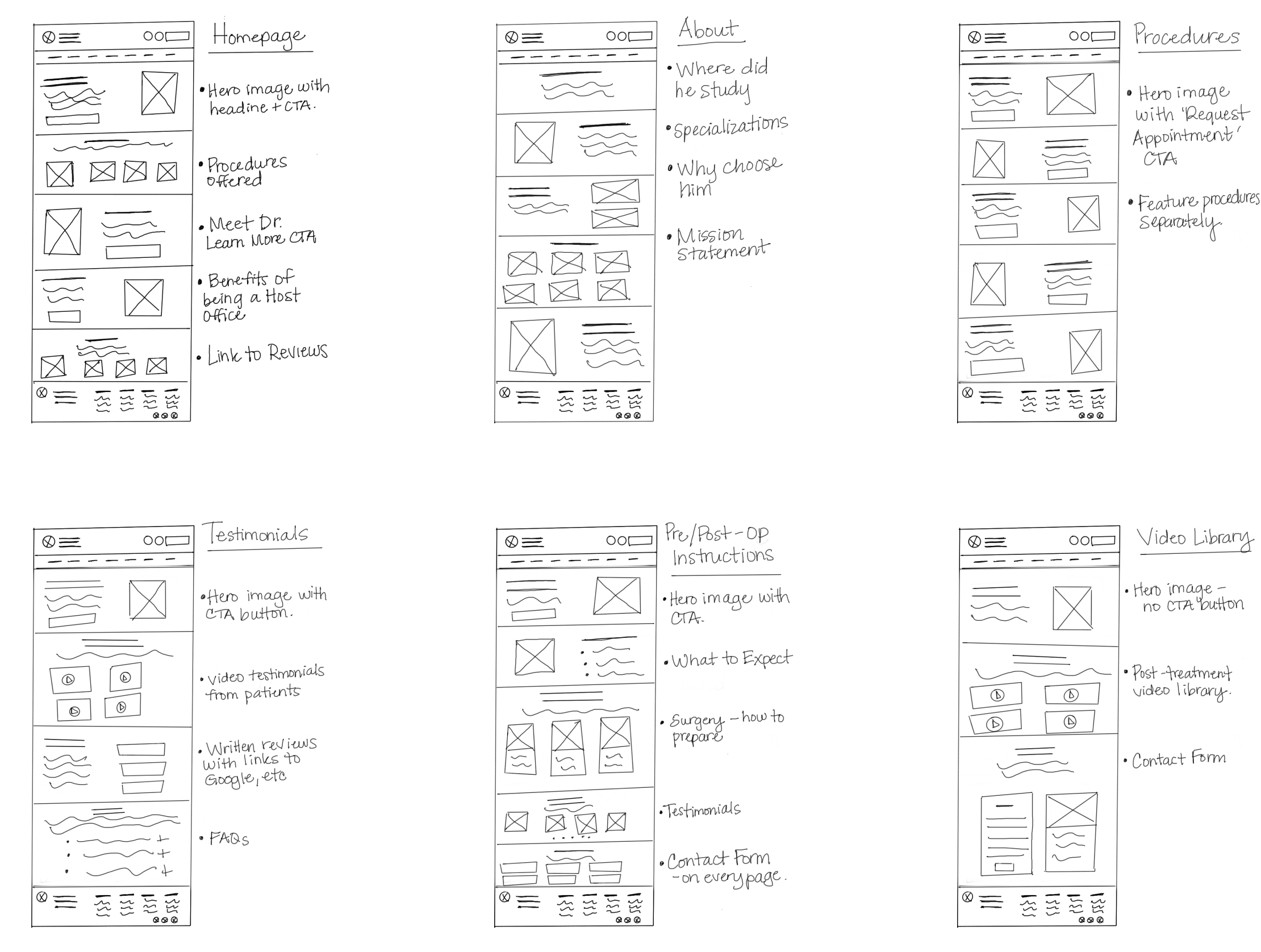
Sketches
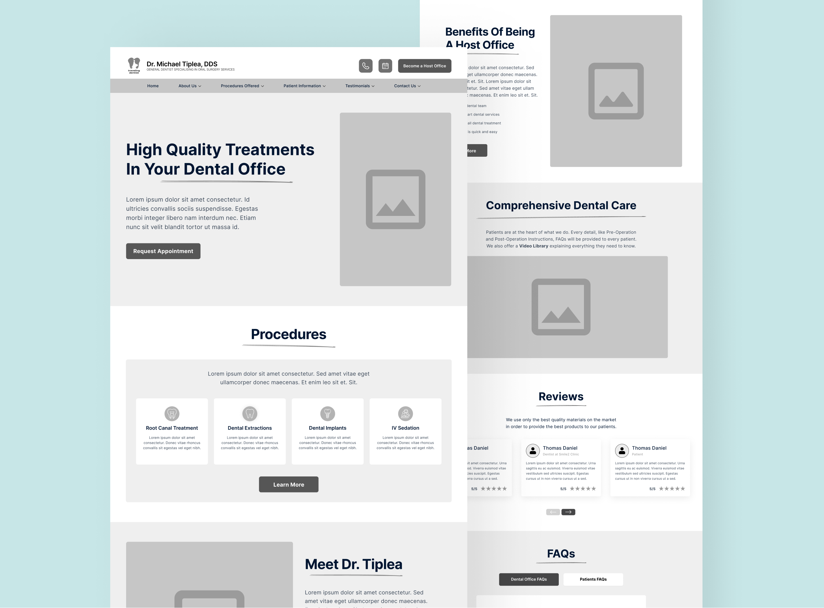
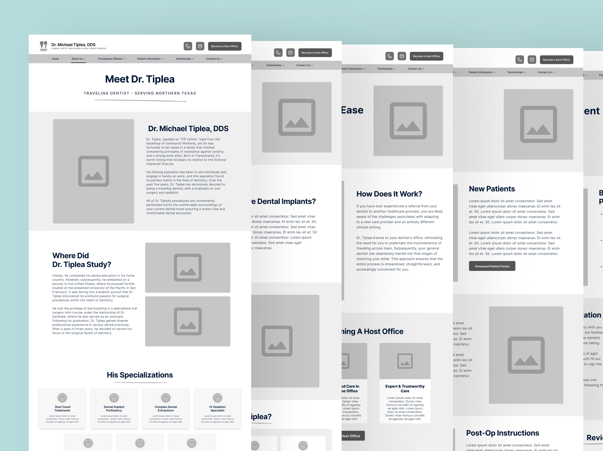
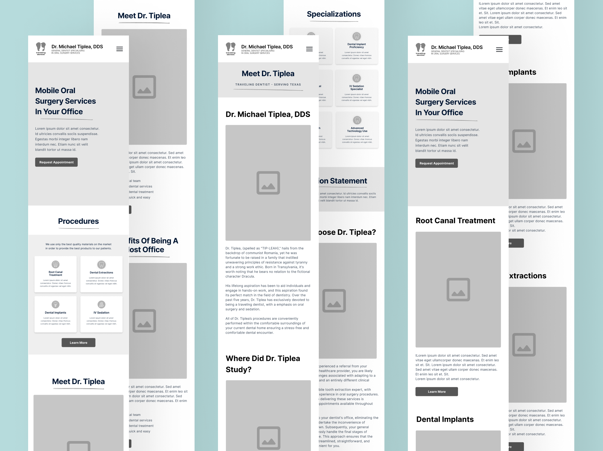
Initial sketches captured the basic layout and flow of the website, which were then refined into high-fidelity wireframes. These wireframes provided detailed representations of each page, including the placement of text, images, buttons, and other elements, serving as a blueprint for the website's design.
High-fidelity Wireframes
UI
User Interface Design
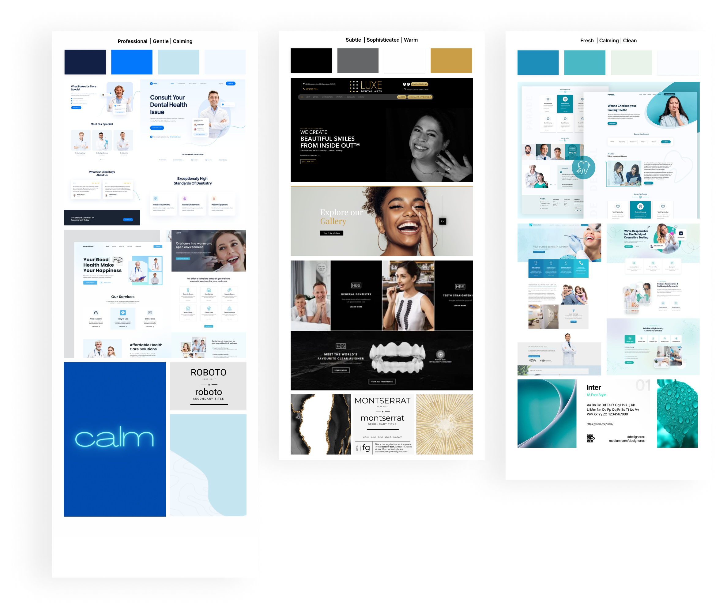
User Interface (UI) Design is the aesthetic discipline that guides the product's visual interaction with its users. It begins with the development of mood boards, which act as visual guides to establish the product's overall aesthetics.
Mood-Boards
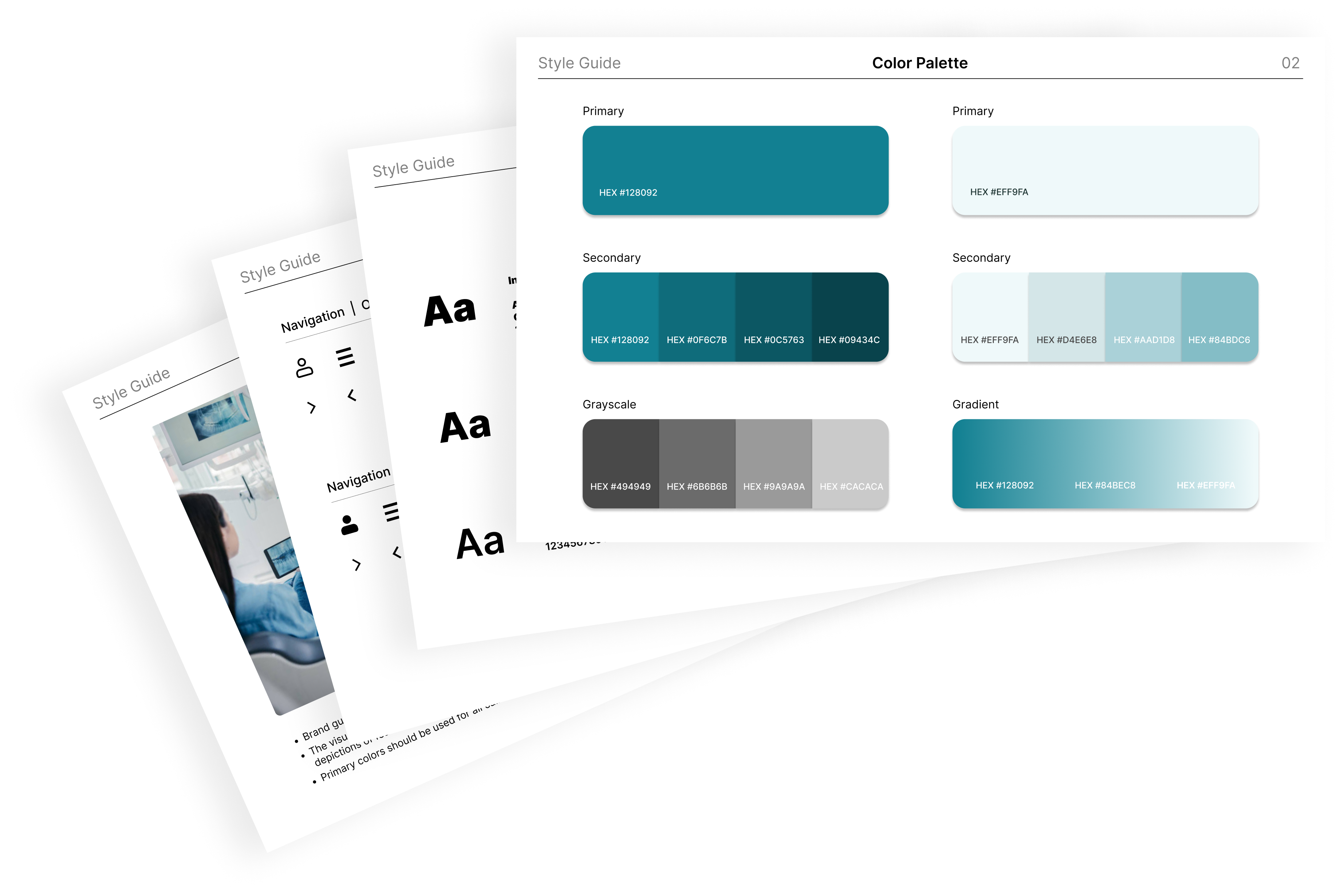
We created mood-boards to explore different visual directions, and selected 3 colour palettes that conveyed trust, professionalism, and warmth, aligning with healthcare standards — Blue, Teal, and Black with Gold accents.
After careful review, the client chose Teal as he felt it aligned best with his brand identity
Style Guide
A style guide was developed integrating the chosen colour palette, typography, and graphic elements.
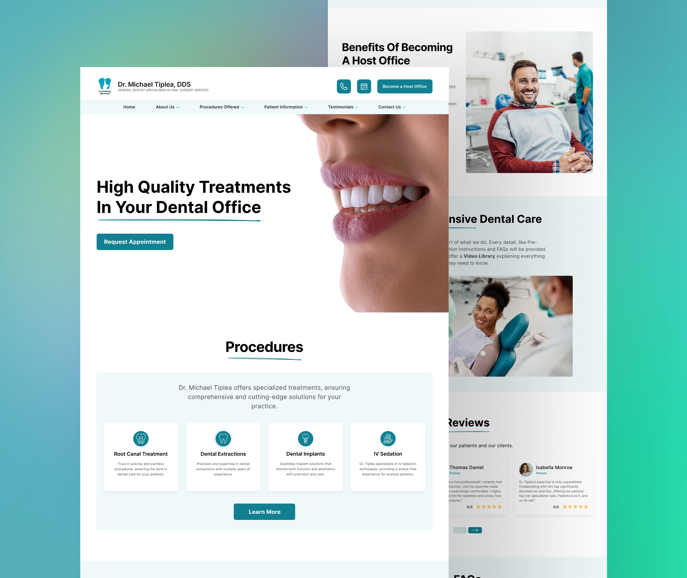
UI
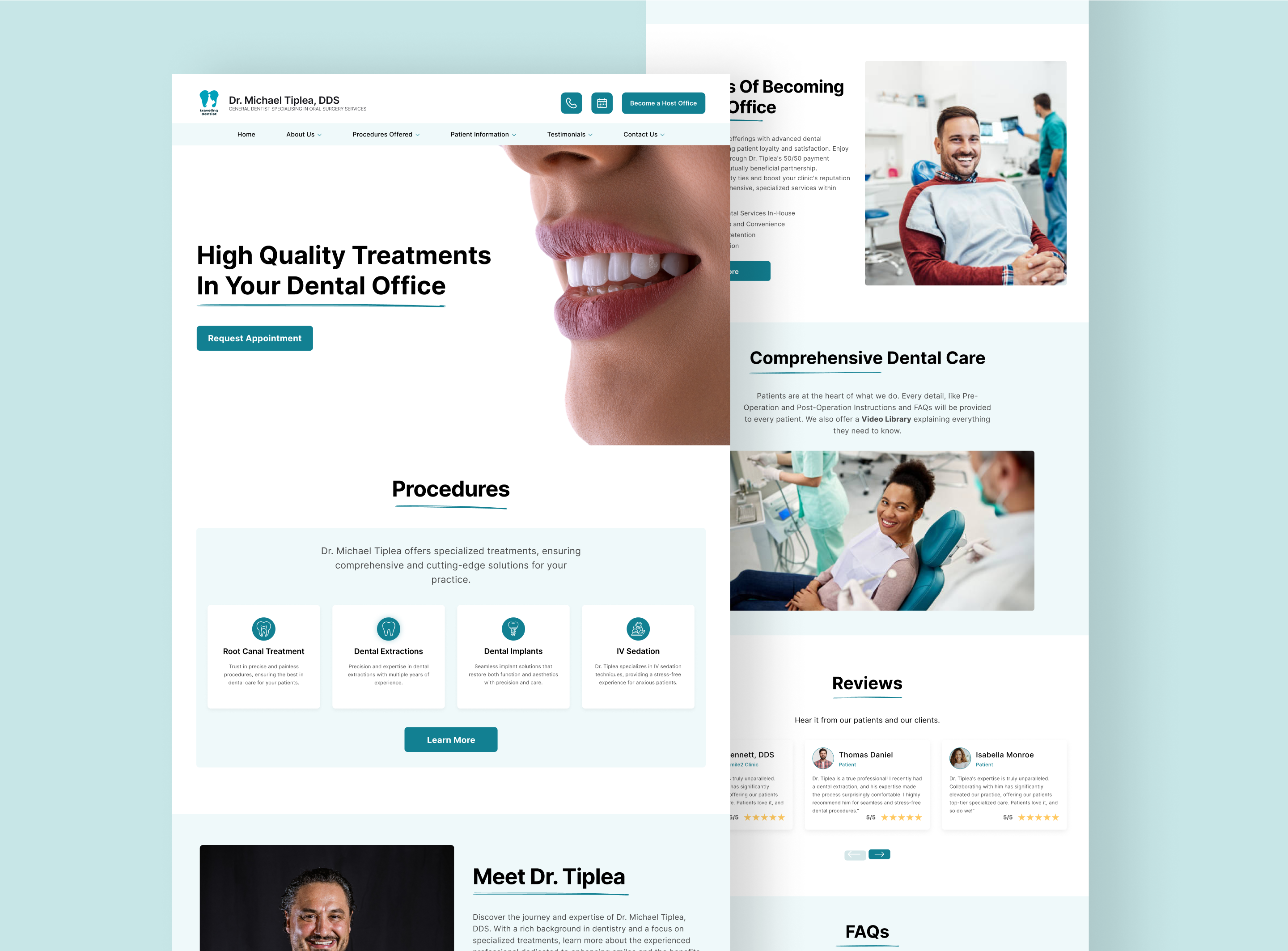
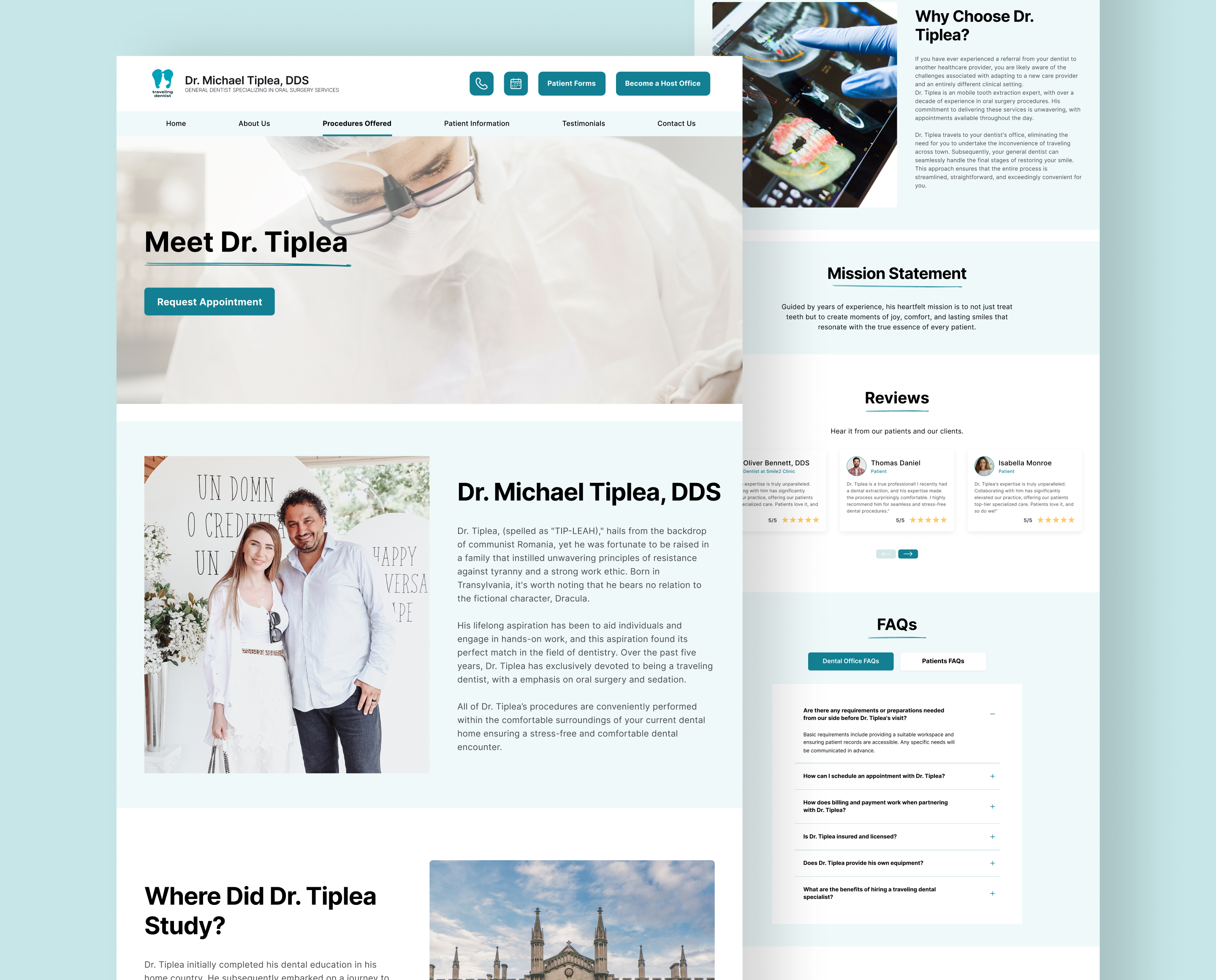
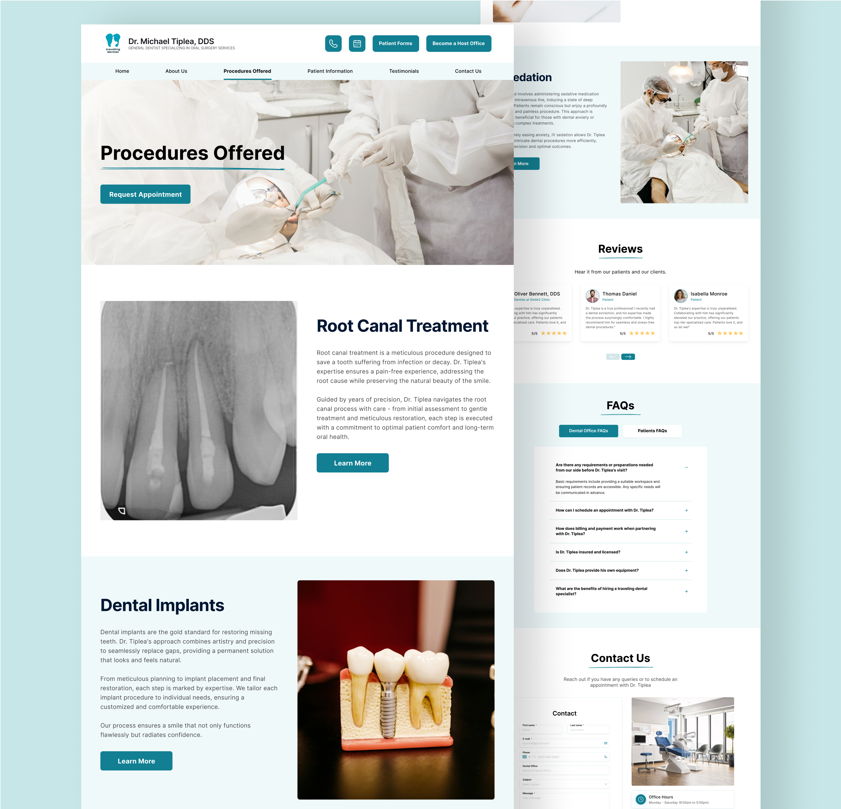
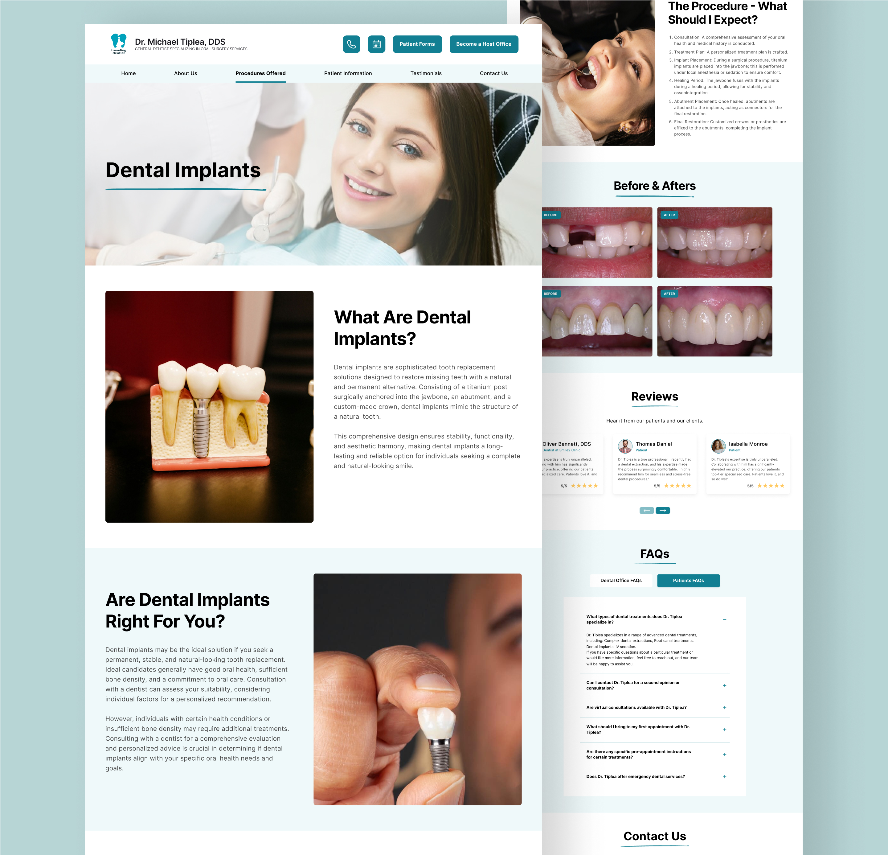
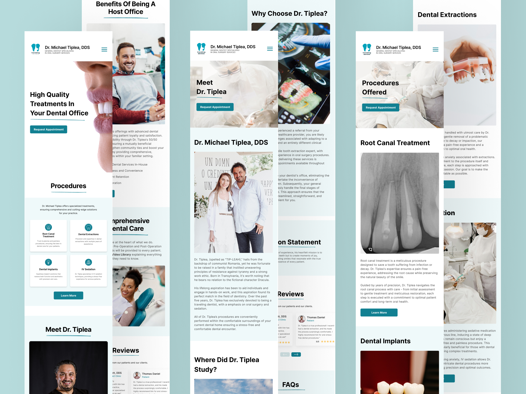
Final Design
Finally, all of the efforts culminated in the final design. The app combines a user centred design with simplicity and functionality.